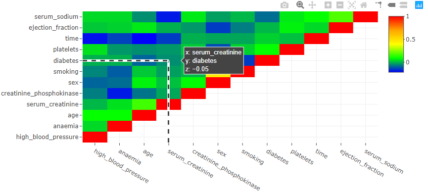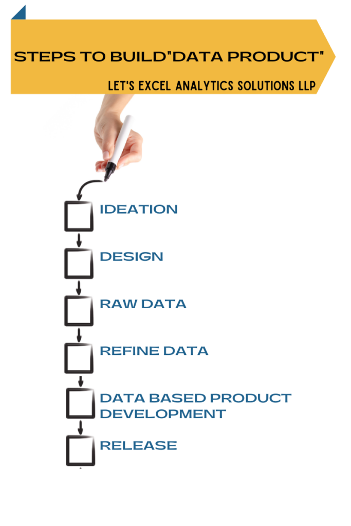
Correlation Vs Causation
The subtle difference in ‘Correlation Vs Causation’ is very important for budding data analysts. Often we get so excited with the patterns in the data that we forget to evaluate if it is a mere correlation or if there is a definite cause. It is very easy to get carried away with the idea of giving some fascinating Insight to our clients or cross-functional teams. In this blog post, let us talk briefly about the difference between correlation and Causation.
Causation
The word Causation means that there is a cause-and-effect relationship between the variables under investigation. The cause and effect relationship causes one variable to change with change in other variables. For example, if I don’t study, I will fail the exam. Alternatively, if I study, I will pass the exam. In this simple example, the cause is ‘study,’ whereas ‘success in the exam’ is the effect.

Correlation
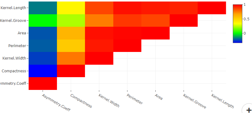
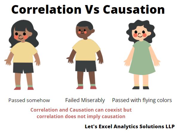
The word correlation means a statistical relationship exists between the variables under investigation. The statistical relationship indicates that the change in one variable is mathematically related to the change in other variables. The variable with no casual relationship can also show an excellent statistical correlation. For example, my friend found out that a candidate’s success in an exam is positively correlated with the fairness of the candidate’s skin—the fairer the candidate, the better the success.
I am sure you will realize how it doesn’t make sense in the real world. My friend got carried away for sure, right?
Take a Way
Always look for Causation before you start analyzing the data. Remember, Causation and correlation can coexist at the same time. However, correlation does not imply Causation. It is easy to get carried away in the excitement of finding a breakthrough. But it is also essential to evaluate the scientific backing with more information.
So, how do you cross-check if the causation really exists? What are the approaches you take? Interested in sharing your data analysis skills for the benefit of our audience? Send us your blog post at info@letsexcel.in. We will surely accept your post if it resonates with our audience’s interest.
Need multivariate data analysis software? Apply here to obtain free access to our analytics solutions for research and training purposes!