Unlock the Best ERP Software Solution with these Top 11 Essential Features

Unlock the Best ERP Software Solution with These Top 11 Essential Features

What are ERP Software Solutions?

Enterprise Resource Planning (ERP) is a software or system businesses utilize to organize and oversee various daily operations effectively. This includes supply chain management, manufacturing, services, financials, and other crucial processes. ERP software solutions facilitate the automation and optimization of specific tasks within an organization, enhancing efficiency and effectiveness. It helps in accounting, procurement, project management, customer relationship management, risk management, compliance, supply chain operations, etc.

ERP software solutions enhance communication and information sharing between company departments. By collecting and consolidating data on activities and status from different divisions, valuable information becomes easily accessible and can be effectively utilized throughout the organization. Thus it can boost productivity and employee satisfaction by providing a clear understanding of how each department contributes to the company’s mission and vision.

How does ERP Software Solutions Work?

ERP software integrates business operative and administrative data into a single application, utilizing a centralized database for consistent and reliable information. By providing real-time reporting and analytics capabilities, ERP software also helps users to generate tailored reports and analyze data. 

ERP Software provides standardized workflows and procedures that help optimize resource allocation and improve productivity. It enables improved communication among different departments and teams by providing a platform for sharing information, documents, and workflows, fostering better coordination and decision-making.

ERP systems are designed to accommodate the growth and changing needs of businesses. They handle large data volumes and adjust to changing requirements through configuration and customization capabilities. This flexibility ensures that the ERP systems can effectively support business growth and seamlessly adjust to the dynamic nature of the organization.

Top 11 Essential Features of ERP Software Solutions

Choosing the best ERP Software Solution is of the most crucial importance as the right software can be tailored to your needs, promotes growth, and integrates seamlessly with existing infrastructure to give you maximum productivity and success. 

Here are 11 essential features of ERP software solutions to make that informed decision of choosing the best one for your business:

Centralized Database

A centralized database is a key feature of ERP software solutions. The software should serve as a central location where all relevant data from various departments and functions within an organization are stored and accessed. It should eliminate the duplication of data, inconsistencies, and discrepancies that occurs from maintaining multiple separate databases thus providing efficiency.

Financial Management

The ERP software must contain the tools and functionalities designed to effectively manage an organization’s financial processes. The financial management feature should enable precise monitoring and control of financial transactions, ensuring accurate tracking of income, expenses, assets, and liabilities along with offering budgeting and forecasting capabilities and allowing organizations to create and manage budgets.

Supply Chain Management

Facilitating the efficient management of procurement, inventory, and supply chain processes are some of the essential functions to be present in the Supply Chain Management feature of the ERP Software Solution. The supplier Relationship Management feature helps the business to ensure quality, reliability, compliance with supplier agreements and effectively manage relationships with suppliers. 

Manufacturing and Production Planning

ERP software solutions should enable effective management of manufacturing processes, planning production activities, and allocating resources efficiently in a business. ERP systems allow for the generation of production schedules by considering factors such as demand, resource availability, and capacity constraints. This facilitates the optimal allocation of resources, machinery, and labor to ensure the efficient achievement of production targets.

Customer Relationship Management (CRM)

ERP software solutions with CRM capabilities provide a centralized database for storing and managing customer information, including contact details, purchase history, preferences, and interactions. It also helps in effective lead and opportunity management by tracking and managing leads throughout the sales cycle. It also follow-ups, assigns tasks and converts leads for potential sales. 

Take a look at our SuiteCRM Implementation Services to manage and enhance customer relationships.

Human Resources Management

ERP Solutions provide effective HR administration by providing a centralized database to store and manage employee data. This includes personal information, employment history, skills, certifications, and performance records. It also helps in the recruitment and onboarding of new employees and the performance management of existing ones ensuring the smooth functioning of the organization.

Business Intelligence and Reporting

ERP Software Solutions enable organizations to gather, analyze, and visualize data to gain valuable insights and make informed business decisions. They offer powerful analytics and visualization tools to analyze and interpret data. Users can generate reports, create dashboards, and use interactive visualizations to gain insights and provide a comprehensive view of the organization’s operations.

Integration and Compatibility

ERP Software Solutions enables businesses to seamlessly connect and communicate with other systems, applications, or modules within the organization. It allows data and processes to flow smoothly between different departments and functions. This ensures that information is shared efficiently, enabling real-time visibility and accurate decision-making. Along with this it coexists and interacts harmoniously with other technologies already in place.

Mobility and Remote Access

This feature of the ERP Solutions enables users to access and utilize the system from anywhere, using various devices. Remote access in ERP software allows authorized users to securely access the system and its functionalities from remote locations. Overall it provides a user-friendly experience, enabling users to stay connected and productive on the go.

Security and Access Controls

ERP software solutions should ensure the protection of sensitive data and regulate user permissions. Implementing measures and protocols to safeguard the system and its data from unauthorized access, breaches, or malicious activities is its main feature. It also enables administrators to manage user permissions and restrict access to specific features and functions. 

Scalability and Customization

ERP software administers organizational growth, adapts to changing business needs, and provides a tailored solution to meet the specific requirements of the business. The software should accommodate expanding operations without compromising performance while also adapting to the unique processes, workflows, and industry-specific needs of the business.

Odoo as an ERP Software Solution

Odoo is a widely adopted open-source ERP software solution, with a user base exceeding three million. It offers a comprehensive suite of business applications and modules. It covers various areas such as accounting, manufacturing management, CRM, sales, and more. Odoo serves as a versatile platform for enterprise resource planning for efficient business management. By leveraging these applications and features, business owners can enhance operational efficiency and streamline their processes effectively. 

Check out our Odoo ERP implementation services now for enhancing your business productivity.

Conclusion

Implementing an ERP system enables businesses to enhance operational efficiency, foster growth, make better decisions, and remain competitive. The integrated nature of ERP software empowers organizations to leverage data effectively, streamline processes, and align resources for long-term success. By embracing ERP, businesses can optimize operations, drive expansion, enhance decision-making capabilities, and gain a sustained competitive advantage. Hence, a business needs to choose wisely the best and most efficient ERP Software solution that matches its interests and helps in its growth.

Looking forward to implementing ERP Services in your organization? Get in touch to explore how Lets Excel Analytics Solutions LLP can help you.

top 25 data analytics software and tools for improved productivity

Top 25 Data Analytics Software and Tools for Improved Productivity

Introduction

Organizations generate and collect vast amounts of data in today’s data-driven world. Data analytics software and tools provide the capability to efficiently process and analyze these large datasets. These software applications are designed to collect, process, research, and interpret large volumes of data. These tools provide a range of functions to help organizations and individuals make sense of their data and derive meaningful insights, make informed decisions, and achieve business objectives effectively. 

They can handle structured and unstructured data from various sources, including databases, spreadsheets, text files, social media, and sensor data. They enable users to interact with data visually and identify trends, patterns, and outliers. Organizations can understand customer preferences, needs, and behavior patterns by analyzing customer data and using them to personalize marketing campaigns, improve customer experiences, and build stronger customer relationships. 

How Data Analytics Software and Tools Improve Productivity in an Organization?

Data Analytics software and tools provide valuable insights into an organization’s operational process. They include performance metrics, workflows, and redundancies. By analyzing historical and real-time data, organizations can identify trends, patterns, and insights that guide decision-making. This reduces reliance on intuition or guesswork, leading to more effective and efficient decision-making processes. 

Some of the advanced tools and software of data analytics use techniques of predicting and forecasting future outcomes of certain decisions taken. This capability enables organizations to anticipate demand, identify potential risks or opportunities, and proactively take actions to maximize productivity. Along with that, by accurately forecasting demand and optimizing inventory levels, organizations can avoid stockouts and reduce inventory holding costs. This leads to improved productivity

Data Analytics tools and software also helps organization increase productivity and efficiency by providing the management with deep insights into customer behavior, preferences, and needs. With these data, organizations can follow a customer-centric approach that enhances productivity.

Top 25 Data Analytics Software and Tools for Improved Productivity

There are a number of software available across platforms that enables an organization to improve productivity and efficiency through a Data-Driven structure:

  1. Google Data Studio – It is a powerful data visualization and reporting tool offered by Google. It allows users to create interactive and customizable reports and dashboards using a wide range of data sources.
  1. Tableau – A Business Intelligence Tool to create dynamic and interactive visualizations. Empowering users to explore and understand their data better, collaborate with colleagues, and communicate insights effectively, ultimately drives productivity.
  1. Microsoft Power BI – Microsoft Power BI offers a wide range of data connectors that allow users to connect to various data sources. It also provides advanced analytics capabilities, such as quick insights, forecasting, clustering, and anomaly detection.
  1. Odoo – Odoo offers a comprehensive suite of applications that enable organizations to streamline their operations and enhance productivity. It offers modules for sales, CRM, inventory management, project management, accounting, manufacturing, human resources, and more. The software comes with interactive data analytics dashboards for streamlining your internal as well as external business processes.
  1. SAS Analytics – SAS Analytics encompasses a wide range of data management capabilities that enable organizations to analyze data, derive insights, and make data-driven decisions. It provides industry-specific solutions tailored to various sectors, including banking, healthcare, retail, manufacturing, and more. 
  1. SuiteCRM – SuiteCRM provides a range of features to manage customer interactions, sales processes, marketing campaigns, and customer service. It is a flexible and customizable solution that helps organizations build and maintain strong customer relationships. The software comes with interactive dashboards for streamlining your customer relationships.
  1. Knime Analytics Platform – An open-source data analytics and visual workflow tool, Knime Analytics Platform provides a rich set of analytics and modeling tools that includes a wide range of statistical and machine learning algorithms that can be applied to datasets for tasks such as classification, regression, clustering, and text mining.
  1. Apache Spark – It is an open-source big data processing framework known for its high-speed data processing capabilities. It leverages in-memory computing, enabling it to cache data in memory and perform operations significantly faster than traditional disk-based processing systems.
  1. DataRobot – It is an automated machine learning (AutoML) platform that helps organizations build, deploy, and manage machine learning models. It performs tasks such as data cleaning, feature selection, algorithm selection, hyperparameter tuning, and model evaluation. This automation saves time and reduces the need for manual intervention. 
  1. Amazon QuickSight – A cloud-based business intelligence (BI) tool offered by Amazon Web Services (AWS) that provides organizations with a fast, easy, and cost-effective way to analyze data, create interactive dashboards, and gain insights from their data.
  1. ThoughtSpot – ThoughtSpot’s unique feature is its search-driven analytics capability. Users can enter natural language queries or questions in plain English, and ThoughtSpot’s search engine intelligently interprets and retrieves relevant data and insights in real time.
  1. Pentaho – It offers a wide range of tools to support data integration, data warehousing, data modeling, and business intelligence (BI) reporting. Hence allowing users to extract data from multiple sources, and transform it.
  1. QlikView – QlikView’s unique associative data model allows users to navigate and explore data intuitively. Unlike traditional query-based systems, QlikView enables users to make dynamic associations between data points. This helps in uncovering hidden relationships and providing a holistic view of the data.
  1. Alteryx – Alteryx is a powerful process automation platform that allows users to combine and transform data from multiple sources. This includes databases, spreadsheets, and cloud services. It provides a user-friendly interface for data blending, advanced analytics, and workflow automation.
  1. Splunk – Splunk can analyze data from a wide range of sources, including event data, metrics, and machine-generated data. It supports structured and unstructured data, enabling organizations to capture and analyze diverse types of information.
  1. Talend – Talend offers a powerful visual interface for designing and executing data integration workflows. It includes capabilities for data quality management, allowing users to assess, cleanse, and improve data quality.
  1. MATLAB – MATLAB provides a powerful set of tools and functions for performing mathematical calculations, creating algorithms, and building models. It also offers powerful tools for data analysis, exploration, and visualization.
  1. Domo – It is a cloud-based business intelligence and data analytics platform. It helps organizations consolidate, analyze, and visualize their data in real-time allowing users to connect and integrate data from various sources.
  1. Looker – Looker offers a variety of interactive visualizations, to present data in a visually appealing way. Users can create interactive dashboards and report to monitor key metrics, track performance, and share insights with others.
  1. MicroStrategy – MicroStrategy enables users to create interactive reports and dynamic dashboards to present data and insights. It provides a suite of tools and features for data discovery, reporting, dashboarding, and advanced analytics.
  1. Sisence – Sisense allows organizations to embed analytics capabilities directly into their applications, products, or websites. This enables end-users to access data insights and analytics without leaving the context of their applications. 
  1. TIBCO Spotfire – It incorporates advanced analytics and predictive modeling capabilities that apply statistical functions and perform predictive analytics. It helps to discover patterns, trends, and outliers in the data.
  1. Yellowfin – Yellowfin provides intuitive tools for data exploration and discovery which makes it easy to navigate through data, apply filters, and perform ad-hoc analysis to uncover insights.
  1. DataPandit – If you are into material science research DataPandit should be your go-to tool for chemometrics, cheminformatics, bioinformatics, etc. However, if you are not a material research scientist still DataPandit could be your go-to tool for solving complex Machine Learning problems.
  1. RapidMiner – RapidMiner provides a rich set of machine learning algorithms and techniques for building predictive models. It enables organizations to extract valuable insights from their data and make data-driven decisions.

Conclusion

Data analysis tools employ various statistical and analytical techniques to extract insights from data. They help organizations efficiently manage and process large volumes of data from various sources. They provide capabilities for sharing reports, dashboards, and insights, allowing stakeholders to access and collaborate on data analysis. This promotes a data-driven culture within organizations. Applying these methods and techniques helps businesses discover hidden patterns, predict future trends, and derive actionable insights to drive decision-making.

Looking forward to implementing data analytics software and tools in your organization? Get in touch to explore how Lets Excel Analytics Solutions LLP can help you.

Business SaaS for Sustainabilty

Selecting Business Intelligence SaaS for building Sustainability

Introduction

Business Intelligence SaaS refers to the delivery of business intelligence tools and capabilities through a Software as a Service (SaaS) model. They enable organizations to gather, analyze, and visualize data from various sources to derive insights and make informed decisions. Business intelligence SaaS involves providing access to BI software, data analytics, and reporting functionalities over the internet, without the need for users to install or manage the software locally. These platforms provide robust analytics capabilities that enable organizations to analyze sustainability data and derive insights. By leveraging data-driven decision-making, organizations can identify areas of improvement, set targets, and track progress toward sustainability goals.

Features of Business Intelligence SaaS

Business Intelligence SaaS typically offers features such as data integration, data warehousing, data modeling, dashboards, interactive reports, and data visualization tools. Some of the key aspects of Business Intelligence SaaS are:

  1. Data Integration: BI SaaS platforms allow organizations to connect and integrate data from multiple sources, such as databases, spreadsheets, cloud services, and APIs. This enables users to access and analyze a wide range of data within a unified platform.
  1. Data Analytics and Reporting: BI SaaS platforms provide tools for performing data analytics, including querying, filtering, and aggregating data to uncover patterns and trends. They also offer reporting capabilities, allowing users to create customized reports and visualizations based on their specific requirements.
  1. Scalability: With Business Intelligence SaaS, organizations can scale their BI capabilities based on their needs. The cloud infrastructure provided by the SaaS vendor allows for flexible storage and processing of data, accommodating growing data volumes and user demands.
  1. Collaboration and Sharing: Business Intelligence SaaS platforms often include features for collaborative data analysis and sharing. Users can collaborate on reports and dashboards, share insights with colleagues, and schedule automated report distribution to stakeholders.
  1. Maintenance and Updates: The responsibility for infrastructure maintenance, software updates, and security patches lies with the SaaS provider. This relieves organizations from the burden of managing and maintaining the Business Intelligence software, allowing them to focus on utilizing insights and driving business value.

Benefits of Business Intelligence SaaS

Business Intelligence SaaS platforms are particularly beneficial for small and medium-sized businesses that may not have the resources or expertise to implement and manage an on-premises BI infrastructure. Additionally, BI SaaS offers a more cost-effective and agile approach to accessing and leveraging business intelligence capabilities, as organizations can pay for the service on a subscription basis, avoiding large upfront costs.

Here is how the software benefits organizations:

  1. Cost-Effectiveness: BI SaaS eliminates the need for upfront hardware and software investments, as well as the costs associated with infrastructure maintenance and software updates. Organizations can subscribe to a BI SaaS platform and pay a regular subscription fee based on their usage, making it more cost-effective.
  1. Rapid Deployment: Implementing on-premises BI solutions can be time-consuming and resource-intensive. With BI SaaS, organizations can quickly get started with their data analysis and reporting initiatives. The infrastructure is already in place, and the software is readily accessible.
  1. Accessibility and Collaboration: BI SaaS platforms enable users to access data and insights from anywhere with an internet connection. This accessibility promotes collaboration and sharing of reports, dashboards, and insights across teams and departments.
  1. Integration with Multiple Data Sources: BI SaaS platforms often offer integration capabilities to connect with various data sources, such as databases, cloud services, and APIs. This allows organizations to bring together data from different systems and sources into a unified view for analysis and reporting.
  1. Enhanced Data Security: Reputable BI SaaS providers prioritize data security and employ robust security measures to protect sensitive information. They implement data encryption, access controls, and other security mechanisms to ensure the confidentiality, integrity, and availability of data.

Overall, BI SaaS provides organizations with the tools and infrastructure needed to transform raw data into actionable insights, enabling data-driven decision-making and improving business performance.

How can you integrate Business Intelligence SaaS for building Sustainability?

Integrating Business Intelligence (BI) SaaS into sustainability initiatives can help organizations make data-driven decisions, measure their environmental impact, and drive sustainability goals. Here are some steps to integrate Business Intelligence SaaS for building sustainability in your organizations:

  1. Define Sustainability Goals: Start by clearly defining your sustainability objectives and key performance indicators (KPIs). Determine what aspects of sustainability you want to measure and improve, such as energy consumption, waste management, carbon footprint, water usage, or supply chain sustainability.
  1. Identify Relevant Data Sources: Identify the data sources that contain the necessary information for measuring sustainability metrics. This may include energy bills, waste management records, operational data, supplier data, or external data sources like weather patterns or market trends. Ensure that these data sources can be integrated into your BI SaaS platform.
  1. Data Integration and Preparation: Integrate the relevant data sources into your BI SaaS platform. This may involve data extraction, transformation, and loading (ETL) processes to structure and prepare the data for analysis. Ensure data quality, consistency, and integrity throughout this process.
  1. Define Sustainability Dashboards and Reports: Use the capabilities of your BI SaaS platform to create customized sustainability dashboards and reports. Visualize the key sustainability metrics, trends, and benchmarks that align with your sustainability goals.
  1. Measure and Monitor Sustainability Metrics: Utilize the BI SaaS platform to measure, track, and monitor sustainability metrics in real-time. This can include tracking energy consumption patterns, waste generation, greenhouse gas emissions, water usage, or sustainable sourcing practices. Set up alerts and notifications to trigger actions or interventions when specific thresholds are reached.
  1. Conduct Data Analysis and Insights: Leverage the analytical capabilities of the BI SaaS platform to perform deeper analysis and gain insights into your sustainability data. Identify patterns, correlations, and trends that can guide decision-making and identify areas for improvement. Conduct root cause analysis to understand the factors influencing sustainability performance.
  1.  Enable Collaboration and Engagement: Use the collaboration features of your BI SaaS platform to engage employees, stakeholders, and partners in sustainability initiatives. Share dashboards and reports to create awareness and foster a culture of sustainability. Encourage feedback, ideas, and participation from relevant stakeholders to drive continuous improvement.
  1. Set Targets and Track Progress: Set measurable sustainability targets based on your insights and goals. Use the BI SaaS platform to track progress towards these targets and communicate the results. Monitor the impact of sustainability initiatives and make data-driven adjustments to achieve desired outcomes.
  1. Reporting and Transparency: Utilize the reporting capabilities of the BI SaaS platform to generate sustainability reports for internal use and external stakeholders. Share the progress, achievements, and challenges in sustainability performance to demonstrate transparency and accountability.
  1. Continuous Improvement: Use the insights derived from the BI SaaS platform to identify areas for improvement, optimize processes, and implement sustainability initiatives. Regularly review and analyze the data to identify emerging trends, opportunities, and risks in your sustainability journey.

Conclusion

By selecting a Business Intelligence SaaS platform for building sustainability, organizations can harness the power of data to drive informed decision-making, monitor progress, and engage stakeholders in their sustainability initiatives. It enables organizations to measure and manage their environmental impact effectively, leading to more sustainable and responsible business practices. It provides the necessary tools and insights to drive positive environmental and social impact while supporting financial and operational success.

Looking forward to implementing Business Intelligence SaaS in your organization? Get in touch to explore how Lets Excel Analytics Solutions LLP can help you.

data-driven culture

How to Create a Data-Driven Culture in Your Organization

Introduction

Data-driven structure drives the conditions, influences, and dynamics that impact the organization’s functioning, performance, and overall success. Therefore many organizations are working towards implementing data-driven culture in their day-to-day operations.
In any organization, the basic functional and operative environment shapes the context in which an organization works. It refers to the specific conditions, factors, and dynamics that directly influence the day-to-day operations and activities within the organization. Therefore, having a strong foundation for the data-driven structure is extremely important to ace the highly competitive corporate world. The article describes the importance of the data-driven structure, its benefits, and how to implement data-driven structure in your organization.

Importance of data-driven culture

It is important that organizations have a proper and data-driven culture in their day-to-day functionality. A data-driven culture refers to an organizational environment where data is central to decision-making, problem-solving, and overall business operations. In a data-driven culture, organizations prioritize the collection, analysis, and utilization of data to drive insights, make informed decisions, and achieve strategic objectives. Some more detailed characteristics of a data-driven culture are as follows:

  1. Data as a Strategic Asset: In a data-driven culture, data is viewed as a valuable asset that can provide valuable insights and competitive advantages. Organizations recognize the importance of data quality, accuracy, and accessibility, and invest in the necessary infrastructure, technologies, and talent to effectively manage and leverage data.
  2. Data-Driven Decision-Making: Instead of relying on intuition or gut feelings, data-driven organizations make decisions based on evidence and analysis. Data is used to identify trends, patterns, and correlations, enabling informed decision-making that aligns with organizational goals and objectives.
  3. Metrics and Key Performance Indicators (KPIs): A data-driven culture establishes clear metrics and KPIs to measure performance and progress. By setting quantifiable targets and regularly monitoring relevant data, organizations can track their performance, identify areas for improvement, and make data-backed adjustments to their strategies and operations.
  4. Data Transparency and Accessibility: Data-driven organizations emphasize transparency and accessibility of data. They establish systems and processes to ensure that relevant data is readily available to the right people in a timely manner. This accessibility allows employees at all levels to access and use data to support decision-making and drive performance improvements
  5. Experimentation and Innovation: Data-driven cultures encourage experimentation and innovation based on data insights. By leveraging data analysis and insights, organizations can identify new opportunities, test hypotheses, and iterate quickly to drive innovation and stay ahead of the competition.

Benefits of the data-driven culture

Such an operating environment is crucial for an organization’s operational effectiveness, employee engagement, customer satisfaction, and financial performance. Some of the benefits a data-driven culture offers are:

  1. Efficiency and Productivity: It ensures that processes, workflows, and resources are optimized for efficiency. It involves streamlining operations, eliminating bottlenecks, and improving productivity.
  2. Quality and Consistency: The data-driven culture plays a crucial role in maintaining and delivering high-quality products or services consistently. By implementing standardized processes, quality control measures, and performance monitoring, organizations can ensure they meet established standards and customer expectations.
  3. Risk Management: The data-driven culture encompasses Risk Management Practices and procedures. It involves identifying potential risks, implementing appropriate controls, and establishing contingency plans to mitigate disruptions or unforeseen events.
  4. Continuous Improvement: It provides a foundation for continuous improvement initiatives within the organization. By monitoring performance metrics, gathering feedback, and analyzing data, organizations can identify areas for improvement and implement changes.

How you can create a data-driven culture in your organization?

Building a data-driven culture is an ongoing process that requires time, effort, and commitment. It involves a collective effort from leadership, employees, and the organization as a whole. By creating an environment that values data, encourages data-driven practices, and supports continuous learning, organizations can foster a culture that leverages data for better decision-making and improved outcomes.

Creating a data-driven culture in an organization requires a deliberate and systematic approach. It is an ongoing process that requires commitment, continuous reinforcement, and adaptation to changing needs and technologies. Here are some steps to help you establish a data-driven culture in your organization:

  1. Data Literacy and Training: Data Literacy and training play a crucial role in fostering a data-driven culture within an organization. When employees are equipped with the necessary skills and knowledge to work with data effectively, they can contribute to data-driven decision-making and drive meaningful insights. Begin by assessing the existing level of data literacy within the organization and design a comprehensive data literacy program that caters to employees at all levels and job functions.
  1. Defining Clear Objectives: By defining clear objectives in a data-driven culture, organizations can provide a roadmap for leveraging data effectively and driving desired outcomes. Well-defined objectives ensure that data initiatives are purposeful, aligned with the organization’s strategy, and contribute to overall success. Ensure that the objectives for data-driven initiatives align with the overall strategic goals of the organization. Identify how data can support and contribute to the achievement of these strategic objectives. This alignment helps prioritize data initiatives and ensures that data-driven efforts are relevant and impactful.
  1. Data Infrastructure and Technology: Data infrastructure and technology are essential components of a data-driven culture. They provide the foundation for collecting, storing, analyzing, and deriving insights from data. Establish a robust data storage and management system that can handle the volume, variety, and velocity of data generated by the organization. This may involve implementing a data warehouse, data lakes, or cloud-based storage solutions and integrating data from various sources and systems across the organization. The right data infrastructure and technology enable efficient data processing, facilitate collaboration, and empower users to extract value from data in a data-driven culture.
  1. Data-Driven Decision-Making: Data-driven Decision-Making is a fundamental aspect of a data-driven culture. It involves using data and insights to guide decision-making processes and drive better outcomes. Determine the key decision points within the organization where data can provide valuable insights. These decision points could include strategic planning, resource allocation, product development, customer segmentation, marketing campaigns, operational improvements, and more. Apply appropriate data analysis techniques to extract insights from the collected data. By embracing data-driven decision-making, organizations can leverage the power of data to make informed choices, minimize biases, and drive better outcomes.
  1. Leadership Commitment: Leadership commitment is crucial in establishing a data-driven culture within an organization. When leaders actively support and champion data-driven initiatives, it sets the tone for the entire organization and encourages employees to embrace data-driven practices. Leaders should allocate resources and investments to support data initiatives within the organization. This includes providing funding for data infrastructure, analytics tools, and training programs. By investing in data capabilities, leaders show their commitment to building a data-driven culture and providing employees with the necessary resources to succeed.
  1. Continuous Evaluation and Improvement: Continuous evaluation and quality improvement are essential components of a data-driven culture. They enable organizations to learn from data-driven initiatives, optimize processes, and drive ongoing improvements. Establish clear KPIs that align with the organization’s strategic goals and objectives. Regularly track and monitor these KPIs to assess performance and identify areas for improvement. Based on the insights gained from data analysis, stakeholder feedback, and root cause analysis, identify improvement opportunities Encourage a culture that values learning, innovation, and continuous improvement.

Conclusion

A data-driven culture empowers organizations to make informed decisions, drive innovation, improve performance, and gain a competitive edge in today’s data-driven business landscape. It promotes accountability, transparency, and continuous improvement, leading to better outcomes and increased success. By systematically implementing these steps, organizations can foster a culture that embraces data, encourages data-driven decision-making, and leverages data as a strategic asset. This iterative approach fosters a culture of learning, agility, and innovation, enabling organizations to stay ahead in a dynamic and data-rich environment.

Looking forward to implementing data-driven culture? Get in touch to explore how Lets Excel Analytics Solutions LLP can help you.

31 Data Visualization Platforms to get the most our of your Data

31 Data Visualization Platforms to Get the Most Out of Your Data

Introduction

Data visualization has become an essential tool for businesses, organizations, and individuals to make sense of complex data and communicate their insights effectively. With the increasing volume and complexity of data, it’s crucial to choose the right data visualization platform that can help you get the most out of your data.

In this article, we’ll introduce 31 of the best data visualization platforms available in the market and provide a comprehensive overview of each platform’s key features, benefits, and drawbacks. We’ll also discuss the criteria for selecting the best data visualization platform and provide a comparison of the platforms based on these criteria.

Criteria for Selecting the Best Data Visualization Platform:

  1. Ease of use: The platform should be user-friendly and intuitive, allowing users to create visualizations quickly and easily.
  2. Customization options: The platform should provide a range of customization options to meet the unique needs of different users and data sets.
  3. Integration with data sources: The platform should allow for seamless integration with various data sources, including databases, spreadsheets, and cloud-based platforms.
  4. Data privacy and security: The platform should ensure the privacy and security of data, particularly for organizations handling sensitive information.
  5. Scalability: The platform should be scalable to meet the growing needs of businesses and organizations.
  6. Affordability: The platform should be affordable, with a range of pricing options to meet the budget constraints of different users.
  7. User support and community: The platform should provide access to a strong user support community and a range of resources, including tutorials, forums, and documentation.

Top 31 Data Visualization Platforms

1. Tableau Data Visualization Platform

Tableau is a powerful data visualization platform that provides a range of tools and features for creating interactive, visually appealing, and insightful representations of data. Here are some of the uses of Tableau for data visualization:

  • Dashboard creation: Tableau provides an intuitive drag-and-drop interface for creating interactive dashboards that can display multiple views of data in a single space. Users can customize the look and feel of their dashboards with a variety of themes, colors, and styles.
  • Data exploration: Tableau’s visualization tools allow users to easily explore and discover insights in their data. The platform provides a range of tools for filtering, sorting, aggregating, and drilling down into data to uncover trends and patterns.
  • Data storytelling: Tableau’s visualizations can be used to tell a story about the data, helping users to communicate insights and findings to stakeholders. The platform provides a range of options for customizing visualizations and adding annotations, making it easy to create visually appealing and impactful data stories.
  • Data analysis: Tableau provides a range of tools for analyzing data, including descriptive statistics, forecasting, clustering, and regression analysis. These tools can be used to gain a deeper understanding of data and uncover hidden patterns and relationships.
  • Data presentation: Tableau’s visualizations can be easily exported and shared, making it a great platform for presenting data to stakeholders. The platform provides options for publishing visualizations to the web, embedding them in presentations, or sharing them with others via Tableau Server or Tableau Public.
  • Data integration: Tableau supports a wide range of data sources, including spreadsheets, databases, cloud-based platforms, and APIs. This makes it easy to integrate data from multiple sources and create a single, unified view of data.
  • Scalability: Tableau is a highly scalable platform that can be used by organizations of all sizes. The platform is designed to handle large amounts of data and can be used to create visualizations and dashboards for a wide range of purposes, from simple data exploration to complex data analysis and modeling.

2. Power BI Data Visualization Platform

Power BI is a single, scalable platform for self-service , enterprise business intelligence data visualization tool that can connect to any data, visualise it, and easily integrate the visualizations into the apps you use every day. Here are some usage of Power BI for data visualization:

  • Create distinctive reports: Power BI visualization is tailored with your KPIs and brand by simply connecting to, modelling, and visualising your data. Get quick, AI-powered responses to your business inquiries—even if you ask in casual language.
  • Gain Insights: Power BI visualization will connect to all of your data sources with the scale necessary to analyse, promote, and share insights across your business while protecting data security, accuracy, and consistency to get the most out of your investments in big data.
  • Make decisions: Power BI visualization will work together quickly on the same data, cooperate on reports, and exchange insights across well-known Microsoft Office programmes like Microsoft Teams and Excel. Give everyone in your organisation the tools they need to take timely, data-driven decisions that lead to strategic actions.
  • End-to-end data protection:  Power BI visualization improved data security for Power BI reports, dashboards, and datasets. Even when exported to other file types like Excel, PowerPoint, and PDF or shared outside of your organisation, persistent protection continues to function.
  • Extensive data connectors: Power BI visualization with more than 500 free connectors available, you may get a complete picture for data-driven decision making. Access hundreds of on-premises and cloud data sources natively, including Dynamics 365, Azure SQL Database, Salesforce, Excel, and SharePoint.

3. QlikView Data Visualization Platform

QlikView is the best data visualization tool for transforming unstructured data into knowledge. It is widely used to compile, search, and visually analyse data so that it can be transformed into insightful business information. It is being used by businesses to quickly derive insights from data. With exceptionally user-friendly interfaces, it adds a whole new level of analytical insights to the data warehouses. In addition to locating connections between data and relationships, QlikView also does direct and indirect searches on all data. Here are key features of QlikView tool :

  • QlikView Desktop :It is a visualization tool that provides an integrated development environment called QlikView Desktop that is used to build transformation models and extract data. This Windows-based platform lets you analyse data, make GUI layouts and visualizations, and export the results as reports.
  • QlikView Server: QlikView provides the presentation layer between end users and servers made up of a combination of QlikView web servers and applications. With proper data access and security, QlikView documents, reports, delimited files, and dashboards are hosted, managed, and distributed using QlikView Server. The server has access points that enable it to connect with different data sources and receive real-time feedback, as well as an in-memory analytics engine.
  • QlikView Publisher : Additionally, QlikView Publisher is a server-side programme that closely integrates with QlikView Script and gives users access to two key features:
  • QlikView directly loads data from a variety of sources, including SAP Net, Informatica, SQL Server, standard files, etc. into QVW files.
  • A tool for the QlikView visualization that is used to construct tasks and trigger-based reloads.
  • QlikView Management Console(QMC): QlikView visualization tool has a  management console that allows for centralised management of all the elements that make up the QlikView environment. It is used by administrators to deploy associative models on the server and to offer data access for a variety of documents.
  • QlikView User Access: It is a front-end part of the QlikView visualization ecosystem and offers numerous entry points in the form of web browsers. These access points give users the ability to run database queries, get data from QlikView Server, and carry out other tasks using a laptop, desktop, or mobile device.

4. Oracle Business Intelligence Data Visualization Platform

Oracle Business Intelligence (BI) is a data visualization technology and tools that offers the industry’s first integrated, end-to-end Enterprise Performance Management System. It includes BI foundation and tools – integrated array of query, reporting, analysis, alerting, mobile analytics, data integration and management, and desktop integration – as well as category-leading financial performance management applications, operational BI applications, and data warehousing. Here are some tools and features provide by Oracle BI visualization : 

  • Interactive Visualizations: With Oracle BI visualization users have access to a large variety of interactive dashboards, charts, graphs, and other data visualization tools. While prompts and suggestions from the system lead customers through the exploration process to unearth new insights, they can filter, drill down, or pivot data right from the dashboard.
  • Oracle Exalytics:  With Oracle BI visualization people may efficiently evaluate large datasets without the help of a technical expert like a data analyst.
  • Self-Service: With the help of this analytical system, even non-technical people will be able to examine, arrange, and understand data. For employees with any degree of data literacy, the information is simple to grasp and share thanks to the clear visuals.
  • Actionable Intelligence: With Oracle BI visualization, Users are better equipped to make judgements about company operations, quotas, forecasts, and much more by evaluating data and spotting trends.
  • Proactive Alerts: Users can configure predefined alerts to deliver them real-time updates whenever the system is triggered or scheduled. Depending on the urgency of the warning, these notifications are transmitted via a preferred channel, such as email, internal file storage, or text messaging.
  • Mobile Access: Oracle BI visualization helps the user’s on preferred mobile device, the entire solution is displayed with a unified interface. This covers gestural and multitouch interactions with advanced features like map graphics.
  • Augmented Analytics: The application of machine learning and AI in the analytics process improves the user experience by streamlining every component of it. The Oracle BI visualization technology enables natural language search queries, remembers previous searches, and makes intelligent choices for the best visualization for each unique dataset.
  • Spatial Visualizations: The Orace BI visualization tools are not restricted to two dimensions; the system also provides a map view in which the data is projected on a fully interactive map. A continuous color-fill feature, size-adjustable markers, image-marker customization options, numerous types of binning, and colour filling in any direction are all possible for this design.

5. SAP Lumira Data Visualization Platform

SAP Lumira  a visualization intelligence tool for building and visualising stories from datasets. It was previously known as a tool for visual intelligence, where users could construct tales to illustrate facts in graphical form and visualise data. Data is entered into Lumira as a data set, and documents can be built on Lumira by using filters, hierarchies, and computed columns. To properly visualise the data, you can choose from a variety of charts, including bar charts and pie charts. Here are some key features of SAP Lumira : 

  • SAP Lumira data visualization tool includes Chart Property Editor and other technical components .
  • SAP Lumira visualization uses datasets to generate tales that are attractively visualised, allowing businesses to accept data and use it to generate insightful stories.
  • Without requiring coding expertise, SAP Lumira visualiztion enables professionals to get data insights and aids enterprises in properly and quickly visualising data.
  • SAP Lumira visualization tools are  ideal for the businesses that want to share the visualization stories on different platforms as it helps the companies with the future market predictions.
  • SAP Lumira visualization provides a wonderful mobile interface with responsive UI experience and has great interaction with SAP Cloud platform and Microsoft Office.
  • When working with big data, SAP Lumira Visualization is gifted with the ability to produce graphical dashboards with charts and maps that are easy to understand and relate to. Consequently, it is perfect for data discovery and application integration.

6. TIBCO Spotfire Data Visualization Platform

TIBCO Spotfire Data visualization enables real-time analytics and visualization of current events, it enables streaming data in Spotfire® analytics. Spotfire Data Streams may mix live real-time data with historical data using native or simple to create custom data connectors thanks to its ultra-fast continuous query processing engine. Here are some of the features of this analytical technology : 

  • Immersive Visual Analytics: For visualization, data discovery, and point-and-click insights, the Spotfire analytics platform and the TIBCO Hyperconverged Analytics advantage provide a seamless, single-pane-of-glass experience. Engage interactively with historical and real-time data: Fully brush-linked, dynamic visuals allow you to drill down or across multi-layer, diverse data sources.
  • Custom Analytics Apps: With the Spotfire Mods framework, you can quickly design and create scalable custom analytics and visualization apps that serve a specific purpose. Being a modder is simple thanks to our compact extension framework. Configure your app specifically to communicate more readily with any visualization library, API, or workflow—ALL within the Spotfire environment. 
  • Interactive AI: Spotfire analytic and visualization technology is more intelligent. In a matter of seconds, our recommendations engine identifies the most intriguing patterns in your data and provides direction for further exploration. You are empowered by bespoke expressions and data functions provided by Spotfire’s embedded data science capabilities. With native R and Python packaged engines, you can build and manage scripts in a single environment. You can also instantly access pre-trained, governed data science models.
  • Real-time Decisions: TIBCO Spotfire Data visualization consumes and analyses both streaming and historical data as a part of the same analysis. Spotfire shortens the time between event and action to improve both human-in-the-loop monitoring and automated decisioning. This is accomplished by using streaming data sources to update analysis in real-time or by building cloud action processes directly from a visualization. 
  • Powerful GeoAnalytics: Spotfire geoanalytics’ enduring strength is well-known. Drill down within and between multi-layered map charts in a seamless, intuitive way for deeper insights and automatic context for location-based data. Recalculate models with automatic marking scheme modifications between visualization layers in real time. 
  • Intelligent Data Wrangling: Data preparation for analysis is sped up using Spotfire software. Data from many sources, especially big data sources, can be combined, cleaned, enhanced, and transformed all immediately inside the analysis environment. Edit inline with an automatically documented, editable, shareable lineage that satisfies audit requirements. Smart machine learning processes streamline data preparation by automating simple operations like AI-powered smart joins.

7. MicroStrategy Data Visualization Platform

MicroStrategy is a Business Intelligence software which provides a variety of data analytics features. It provides Data Discovery, Advanced Analytics, Data Visualizations, Embedded BI, and Banded Reports and Statements as a suite of apps. To pull data for analysis, it may link to data warehouses, relational systems, flat files, web services, and a variety of other sources. MicroStrategy is a market leader in BI software because of features like beautifully styled reports, ad hoc query, thresholds and alerts, and automatic report dissemination. It is acknowledged by Gartner Magic Quadrant as a visionary. Here are some of the important features for data visualization : 

  • Data discovery: MicroStrategy visualization has the ability  to connect and interact with any type of data source and gather and jumble data from several sources to generate useful reports. This software can gather data from several sources like flat files, relational sources, big data sources, cloud systems, etc. 
  • Data Wrangling: The capability of turning data into information that is useful and then modifying it to meet the user’s needs is referred to as “data wrangling.” MicroStrategy visualization uses a variety of data wrangling and parsing techniques to generate reports that are insightful and helpful. Both data scientists and business users can benefit from this feature.
  • Data mining and predictive analysis : MicroStrategy visualization is a great tool for integrating data mining and data modelling tools from other companies. Many different types of users can make use of these tools to create and design reports that are accessible and predictive.
  • Analytical functions : MicroStrategy Visualization provides a vast library of almost 300 functions, including OLAP, data mining, mathematical, financial, and other important tools for creating highly interactive and educational reports and performing statistical studies. 
  • Real-time dashboards and mobile platform : With MicroStrategy Visualization , you can create platforms that, once created, can be accessed and managed from any mobile device and offer real-time data monitoring.
  • Embedded BI : The main benefit of utilising MicroStrategy is its ability to seamlessly interface with other programmes like IBM WebSphere, SharePoint, WebLogic, etc. that enable users to access pre-programmed development-ready portals.

8. Tableau Server Data Visualization Platform

Tableau Server data Visualization  is an online platform that enables you to store and manage Tableau data sources, workbooks, reports, and dashboards made with Tableau Desktop. To make new workspaces, publish reports and dashboards, and share them with other users, you can use a web browser to access Tableau Server. It enables users to connect to a variety of data sources, including SQL servers, Excel files, text files, and more. Users can build links between various data variables by using data servers to combine data from both on-premise and on-cloud servers. Here are some core features of Tableau Server : 

  • Image Role : By using Tableau Server Visualization Image Role, you may increase insight comprehension and aid end users in connecting with and comprehending visualizations. A new field semantic called Picture Role provides a scalable and automated approach to import image assets into Tableau. Tableau can now encode images as exportable row or column headers by dynamically mapping them to links in your data. By using this new feature, it will be feasible to manage image assets externally and keep workbook sizes from growing to an unmanageable extent.
  • Tableau Community : Utilise tools inspired by the Tableau Visualization Community to do common tasks more quickly. Replace specific data sources on a worksheet level without requiring laborious workarounds. By using the Rich Text Editor when creating on the web, text items can be hyperlinked to provide context and allow for additional research. 
  • Tableau Embedded Analytics : It Utilises Tableau Embedded Analytics to its full potential in a more scalable, flexible, and economical manner. Our most recent licence model allows for customizable pricing that works for your company by allowing you to pay for consumption rather than users. To optimise the return on your data efforts, our new option combines a cutting-edge licencing strategy with our top-notch analytics platform. 
  • Tableau External Actions: To assist in automating business operations and help you save time and money, Tableau External Actions offers a direct interaction with Salesforce Flow. You can conduct processes and make choices in context by connecting your dashboards to Salesforce without ever leaving Tableau. With just one click, you can now send a customer invoice, escalate a case, and do much more.
  • Drive smarter decisions : Tableau visualization promotes confident decision-making and uses market-leading AI to maximise the value of your data. By incorporating Data Stories, automated plain-language tales, into dashboards, you can save time and make analytics simple for everyone. Using Ask Data, explore and respond to important business issues. Explore deeper with AI-driven insights by learning the “why” with Explain Data. To become a data-driven organisation, map your data journey with Tableau Blueprint.
  • Deploy flexibility : Tableau visualization integrates deeply with your corporate architecture to make the most of your technological investments. Choose between on-premises and public clouds, setup servers, handle software updates, or grow hardware capacity in accordance with your needs. By discovering, sharing, collaborating, and studying data from your mobile device, tablet, or computer, you may connect to any data and amplify cooperation. With Tableau Advanced Management, which offers better scalability, increased efficiency, and enhanced security, you can build and expand mission-critical analytics while keeping control. To stay compliant more effectively, keep an eye on consumption in one environment.

9. SAP Crystal Reports Data Visualization Platform

SAP Crystal Reports is a BI application for creating analytical reports from SAP and other non-SAP data sources, including Microsoft Excel, Oracle, SQL Server, and MySQL. Knowing how to use this tool enables organisations to create sophisticated reports and make business choices that are correct and lucrative for them. Almost any data source can be used to generate reports using this system. Making sense of data and revealing significant relationships that could otherwise go undetected is made easier by the use of formulas, cross-tabs, sub-reports, and conditional formatting. Data analysis is made easier to grasp with the use of data visualization tools like maps and graphs that visually express information. Here are some advantages of SAP Crystal Reports Visualization  : 

  • Flexible and customized report : Using SAP Crystal Reports, which has a high level design interface and effective procedures, you can easily produce properly structured, pixel-perfect reports. 
  • Powerful report delivery options : The end customers of the organisation can receive customised reports in the language and format of their choice.
  • Data source connectivity : Direct access to information sources is possible. Data sources include native, ODBC, OLE DB, and JDBC access to relational, OLAP, web services, XML, enterprise data sources, and salesforce.com.
  • Expanded support : By allowing more data to be exported to a single worksheet rather of spanning numerous worksheets, you can fully utilise the Excel file format.
  • flexible report design : With drag-and-drop ease, easily create straightforward reports that offer sorting and grouping advice.

10. IBM Cognos Analytics Data Visualization Platform

IBM offers an integrated business intelligence package called IBM Cognos Business Intelligence, which is web-based data visualization technology. It offers a toolkit for tracking events and data, doing analytics, and creating scorecards. The software comprises a number of elements created to satisfy the various information needs of a business. Like IBM Cognos Framework Manager, IBM Cognos Cube Designer, and IBM Cognos Transformer, IBM Cognos is made up of several parts. This business software offers a number of tools for data gathering and the creation of informative reports that are easy to understand. Cognos also provides the opportunity to view reports in XML format and export reports in either PDF or XML format. Here are some of the extensive features of this visualization technology: 

  • Connectivity :  Spreadsheets and CSV files can be used to import data. Connect to a variety of data sources, such as SQL databases, Google BigQuery, Amazon, Redshift, and more, in the cloud or on-premises. 
  • Prepares Data :  AI-assisted data preparation can help you clean your data more quickly. Data from various sources is cleaned and prepared, calculated fields are added, data is joined, and new tables are created.
  • Create dynamic dashboards : IBM Cognos visulaization quickly designs interactive dashboards that are appealing. Drill down for additional information, share through email or Slack, and produce infographics automatically by dragging and dropping data.
  • Identify patterns : Ask a query in straightforward English to the AI assistant to view a depiction of the response. To forecast seasonal trends, use time series modelling. 
  • Personalised reports : Autonomously keep your stakeholders informed. Create dynamic, customizable, multi-page reports that you can distribute in the forms that your stakeholders prefer.
  • Get Insights : Without any prior knowledge of data science, gain deeper insights. With statistically reliable time-series forecasting, you may confirm what you already know, discover what you don’t, and detect patterns to take into account.

11. TIBCO Jaspersoft Data Visualization Platform

TIBCO Jaspersoft is an Embedded Analytics and Reporting Software. Jaspersoft embedded analytics software is the most flexible, customizable, and developer-friendly business intelligence platform in the world. Users can simply build their own reports using self-service environments created using Jaspersoft software. Create clear metadata labels for your data, then give users a drag-and-drop report builder to handle the rest. Here are some of the extensive features : 

  • Extensive Datasource Support :  The TIBCO Jaspersoft database support as JasperReports Library is accessible via a variety of servers, including JDBC and JNDI connections, Java Bean DataSources, File CSV data sources, Custom JRDataSources, Hibernate Connections, Mondrian OLAP Connections, XMLA Server Connections, and Hadoop-Hive Connector.
  • Flexible and Embeddable Server Architecture : TIBCO Jaspersoft  is an open Standards architecture based on the Spring Framework. Additionally, it supports HTTP APIs, REST, and SOAP-based web services for easier application and workflow integration. It can also connect to current identity management systems and third-party external authentication and authorisation systems (LDAP, CAS, JAAS, etc.). alternatives for cloud (SaaS and PaaS), virtualized, and on-premises deployment and also capable of multi-touch applications and mobile applications. 
  • Centralized Reporting :  It supports a variety of output formats, including HTML, XLS, XLSX, PDF, CSV, DOCX, RTF, Flash, ODT, ODS, etc. It offers self-service access to reporting and analytics.
  • Data analytics :  It contains drill-down, filtering, formatting, animation charting, and other interactive report-making features. Additionally, it allows dynamic queries based on end-user controls and selections.
  • Optimised Dashboard : It is a web-based drag-and-drop dashboard designer that enables interactive tables, charts, cross-tabs, and analytic views for combining numerous reports into a single dashboard.  
  • Secured Data Access : It establishes user- and role-based access to resources, folders, reports, and dashboards. also the semantic/domain data layer’s row and column data security. Access and Usage Auditing is possible for compliance. Along with multi-tenancy, also handle tenants or organisations. 
  • OLAP Analysis : Multi-dimensional Expression Language (MDX) support for sophisticated analytical queries is provided by this software, which analyses data across multiple attributes and time periods. It has an integrated ad hoc analytical interface and a standard JPivot-based analytic interface that support drill down, drill across, drill up, pivot, filter, sort, and charts against OLAP and In-Memory data.

12. SAS Visual Analytics Data Visualization Platform

SAS Visual Analytics is an advanced, integrated platform for controlled discovery and exploration. Users can look at and comprehend patterns, trends, and linkages in data, even if they lack advanced analytical abilities. Reports and dashboards that track business performance can be easily created and shared. The quality of analytics is far higher than that of other BI. It has great visual data exploration features that enable speedy pattern recognition. Here are some extensive features : 

  • See the big picture : SAS Visualization make quick use of ideas and clearly defined related measurements to identify significant correlations in your data. Find, visualise, and narrate tales and insights that are simple to comprehend and to explain by combining machine learning with explanations in natural language. Investigate all possibilities, ascertain the cause of an event, and sift through your data to find opportunities that are buried deep. Highlight important links, outliers, clusters, and more automatically to illustrate crucial conclusions that motivate action.
  • dynamic visuals : SAS Visualization customises beautiful interactive reports and dashboards. Key performance indicators should be succinctly summarised and shared online and via mobile devices. Executives and front-line employees may easily interact with and collaborate on insights, slice and dice them to find their own answers, and use them to better understand business performance.
  • data insights : Without the need for programming, simple-to-use predictive analytics enables even business analysts to evaluate potential outcomes and make better, data-driven decisions. Manual experimentation is no longer necessary thanks to clever algorithms. Additionally, you can collaborate with specialists to concentrate on what is most important.
  • geographical context : SAS Visualization merges traditional data with location data, you may give your analysis and visualizations a geographic context. In order to evaluate data in novel ways and find location-specific opportunities, location analysis brings the “where” factor to the foreground. This allows you to grasp the whole picture before making judgements. 
  • Streamline the discovery process : With drag-and-drop simplicity, self-service data preparation enables business users to import their own data, join tables, apply data quality functions, generate calculated columns, and more. SAS Visual Analytics helps your entire organisation adopt analytics more quickly and broadly by enabling users to access, integrate, clean, and prepare their own data in an agile and reliable manner.
  • Chat-enabled insights : With the help of SAS Visualization, You can build and use unique, natural language chatbots using a simple, low-code visual interface. Through a conversational, natural language interface, you can access data, reports, and visualizations, receive text responses, and even use analytics and AI. Set up bots within the SAS environment for simpler insight access, or connect to third-party platforms to make them available globally. Insights from data can now be obtained as easily as sending a message.
  • ​​Open integration for developers : Enhance interactive creative visualization with third-party JavaScript libraries like D3 and C3 within SAS Visual Analytics. Access SAS analytics, data, and services by utilising open source development resources for programmers and REST APIs for any client language.

13. Microsoft Power View Data Visualization Platform

Power View makes it possible to interactively explore, visualise, and present data, which promotes natural ad-hoc reporting. Power View’s adaptable graphics make it possible to quickly study large data sets. The dynamic data visualizations make it simple to present the data with only one Power View report. Your workbook’s data model serves as the foundation for Power View. You can either begin with a Data Model that is already present in Power Pivot or you can build a Data Model directly from Power View. We will assume that you are familiar with Power Pivot’s Data Model fundamentals throughout this lesson. If not, we advise you to first read the Excel Power Pivot tutorial. Here are some features of Power View: 

  • Create Power View : Excel’s Power View add-in must be activated in order to create a Power View. Then, based on your Data Model, you can construct a Power View sheet with Power View, which can accommodate a variety of various data visualizations.
  • Power View Sheet :The Power View sheet is made up of a number of different parts, including the Power View canvas, Filters area, Fields list, Layout regions, and Power View Ribbon tabs. 
  • Power View Visualizations : The main feature of Power View visualization is its numerous types of data visualizations, which let you portray the data, visualise it, and then explore it in a dynamic way. By quickly moving between different visualizations, diving up and down into the data, and exposing the substance of the data, you can handle big data sets with thousands of data points.
  • Visualization with Multiples : Power View Visualization has the ability to display Chart representations in Multiples. In Power View, a grid of Charts with the same axis is possible. Vertical or horizontal multiples are both possible. 
  • Visualization with Tiles : It may take some time to scroll up and down when there is a lot of data to display at once. With Tiles, Power View Visualization makes this operation incredibly simple for you. Containers on a navigation strip depending on a field in your data are known as tiles. The value of the field is selected when you click on a Tile, and your visualization is filtered as a result. You can use data-bound graphics, such as sports images for Tiles, to provide your navigation strip with a visual indication.
  • Hierarchies in Power View : You can construct a hierarchy to treat all of the nested fields in your data as one field if your data has nested fields. You can either use a hierarchy that is already established in the Data Model and that you created in Power View for visualization, or you can develop your own hierarchy in Power View and use it for visualization. In Matrix, Bar Chart, Column Chart, and Pie Chart visualizations, you can drill p and drill down the hierarchy. A Pie Chart with a Column Chart can have a hierarchical filter.
  • Key Performance Indicator : Key performance indicators (KPIs) give you the ability to monitor your progress towards your stated objectives. From Power View, you may construct KPIs in the Data Model. The KPIs can then be depicted in attractive Power View visualizations, and aesthetically pleasing reports can be generated. Since it’s probable that the KPIs will need to be changed as time goes on, you can also edit the KPIs from Power View.

14. Google Data Studio Data Visualization Platform

Users can create personalised dashboards and simple-to-read reports using Google Data Studio, a web-based application for data visualization. It aids in tracking important KPIs for clients, visualising trends, and evaluating performances over time. Google Data Studio (GDS) is a fantastic, free data visualization tool that enables you to create customizable, eye-catching reporting and interactive dashboards. Report sharing and scheduling are made simple by Data Studio’s many user-friendly features. We track important KPIs for clients using Data Studio, which also helps us to see trends and evaluate performance over time. The old Google Analytics interface, which has a remarkably small functionality range, is essentially upgraded in Data Studio. Here are some of the extensive features of GDS : 

  • Smart Dashboard : The UI and dashboard of Data Studio are similar to those of Google Drive. As a result, you have extensive knowledge of the tool’s user interface. You can look for reports, templates, and data sources using the top-left Search Data Studio box. You can change the visibility of Reports, Data sources, and Explorer under the Recent section.
  • Data Collection Sources : By using Data Studio Visualization, you can avoid handling several copies of work-related Google Sheets or Microsoft Excel files. The programme can evaluate unprocessed data from more than 800 data sets and 490+ data connectors. As a result, you can now import data from third-party sources like Funnel, TapClicks, Amazon Seller Central, Asana, Jira Cloud, etc. Additionally, you can permit the tool to access and analyse data from other Google products, including Campaign Manager 360, Google Analytics, MySQL, and Google Sheets.
  • BI Engine with Performance-Driven Memory : The BI Engine from the Google Cloud BigQuery team provides Data Studio with sub-second speed. It is a service for accessing and analysing data in memory that may be integrated with your personal BigQuery data warehouse. As a consequence, you may instantly update and load a dashboard with live data from hundreds of sources.
  • Smart Data Visualization : The Data Studio report’s view mode responds quickly because of sophisticated programming capabilities like drill-downs, cross-chart interactions, and controls for chart interactivity. In order to gain different insights from your reports, a reader can change practically everything, from filters to metrics. By breaking down your graphs and tables into individual pieces of data, Data Studio Explorer allows the audience to go deep into your report. When viewing the databases in a report, viewers do not necessarily need to be specialists in SQL databases. The viewers have access to visual queries for database exploration.
  • Real-Time Collaboration : You may collaborate on the same Data Studio report in real-time with your collaborators, much like with other Google productivity products. You can invite people to collaborate with you, control their access levels, or obtain a public link for social media from the Share menu at the top of the report. When you invite someone to join your Data Studio workspace, their Google profile will appear in the menu bar.
  • Ease to Use : Users from Google Workspace are already accustomed to its user-friendly online interface. The workspace for altering reports allows for full drag-and-drop operations. For any item you utilise in your reports, you may access a panel with specific property options. If you utilise Data Studio’s ready-to-use templates, you also won’t need to spend a lot of time learning about graphs and tables. There are eight different report categories to pick from in the Templates collection. 
  • Setting Up a Report : Regularly sharing the data visualization report, or as the customer prefers, is a crucial duty. You can forget to provide project reports to your customer while you’re busy managing the team and different responsibilities. You may plan ahead with Data Studio’s Schedule email distribution tool. You may design a report for your customer and arrange for delivery. When the report is due, Data Studio will instantly let your customer know. You may also modify the Repeat settings to tell the tool whether the customer needs to view reports at specific intervals.

15. Plotly Data Visualization Platform

Plotly is an open-source Python data visualization package that supports a number of graph types, including line charts, scatter plots, bar charts, histograms, area plots, and others. In this post, we’ll look at how to use plotly to create a simple chart and how to make a plot interactive. But before getting started, you might be asking why learning plotly is necessary, so let’s have a look at that. Plotly creates interactive plots where we can zoom in on the graph or add more information like data on hover and many other things using Javascript in the background. Here are some of the extensive features : 

  • Easy to Use : Plotly Visualization is an easy-to-use data visualization programme that provides quite sophisticated visualization features. To effectively utilise all tools and capabilities, no special expertise or knowledge is required. Even more, it offers an open development methodology that enables users to completely customise functionality. The dashboard’s simplicity and cleanliness make it less intimidating for beginners.
  • Modern Analytics : Plotly visualization is brimming with powerful analytics capabilities that can handle computations for NLP, ML, forecasting, and more. Working with the well-known Python, Julia, and R languages is free for data scientists.
  • Greater Productivity : Through the use of centralised project dashboards, users may quickly speed up work and prevent bottlenecks and delays. Teams may easily communicate and share files.
  • Reduced Costs : Plotly visualization is capable enough for consumers to do without the requirement for a specialised group of IT specialists and developers. It can perform duties that call for an IT staff, front-end developers, and back-end developers. Additionally, it provides a wide range of pricing options that can meet users’ demands for both on-premises and cloud-based solutions.
  • Scalability : Plotly visualization can assist lone researchers, SMBS, startups, and even large organisations. Even for lone practitioners and small teams, all enterprise-grade technologies are accessible.
  • Total Customization : Any user’s experience with Plotly can be completely customised using its open API. It can simply operate with pre-existing workflow architecture and interface with third-party programmes.

16. D3.js Data Visualization Platform

A JavaScript package called D3.js allows users to manipulate documents using data. Using HTML, SVG, and CSS, D3 enables you to bring data to life. With its focus on web standards, D3 combines strong visualization components with a data-driven approach to DOM manipulation, giving you access to all the features of contemporary browsers without shackling you to a proprietary framework. It is becoming more challenging to communicate this information due to the enormous volume of data being generated today. The most efficient way to communicate important information is through visual representations of data, and D3 makes it very simple and flexible to generate these types of data visualizations. It is dynamic, intuitive, and requires the least amount of work. Here are some of the features of D3.js technology: 

  • Uses Web Standards: To build interactive data visualizations, D3 is a very potent visualization tool. It uses SVG, HTML, and CSS, three current web standards, to produce data visualization.
  • Data Driven: D3 is data-driven. To construct various sorts of charts, the programme can use static data or obtain information from a remote server in a variety of forms, including Arrays, Objects, CSV, JSON, XML, etc.
  • DOM Manipulation: Based on your data, D3 lets you modify the Document Object Model (DOM).
  • Data Driven Elements: Whether it’s a table, a graph, or any other HTML element and/or set of elements, it gives your data the ability to dynamically construct elements and apply styles to the elements.
  • Dynamic Properties: Most of its functions may be provided with dynamic properties thanks to D3. Data functions can be used to specify properties. This implies that your styles and characteristics can be driven by your data.
  • Types of visualization: There are no established visualization formats for D3. However, it allows you to construct anything, including geographical maps, graphs, and bar charts, as well as an HTML table and a pie chart.
  • Custom Visualizations: D3 allows you maximum control over your visualization features because it complies with web standards.
  • Transitions: The transition() function is offered by D3. Because D3 inherently develops the logic to extrapolate between your numbers and identify the intermittent phases, this is incredibly potent.
  • Interaction and animation: D3 has excellent animation support with features like duration(), delay(), and ease (). Animations that transition quickly between states and are responsive to user input.

17. Highcharts Data Visualization Platform

Highcharts is a charting library built entirely on JavaScript that is intended to improve online applications by enabling interactive charting. There are several different charts available on Highcharts. Examples include bar charts, pie charts, line charts, spline charts, area charts, and so forth. A charting software package called Highcharts was first made available in 2009. It is entirely written in JavaScript. It was developed by Highsoft in Vik, Norway, and has frequently been discussed in publications like Finansavisen and Dagsrevyen. 

  • Compatability : Highcharts visualization works flawlessly on all popular browsers and mobile operating systems like iOS and Android.
  • Multitouch Support : Highcharts visualization supports multitouch on systems with touch screens, such as iOS and Android.
  • Free to Use : Ideal for Android and iPhone/iPad-based smart phones and tablets.
  • Lightweight :  highcharts.js core library with size nearly 35KB, is an extremely lightweight library.
  • Simple Configurations : Highcharts visualization uses json to define various configurations of the charts and is very easy to learn and use..
  • Multiple axes : Highcharts visualization is not limited to the x and y axes. It allows for numerous chart axes.
  • Configurable tooltips : When a user hovers their cursor over a chart point, a tooltip appears. Highcharts has a tooltip intrinsic formatter or callback formatter to allow programmatic control of the tooltip.
  • DateTime support : Highcharts visualization specifically handles date and time. offers a wide range of built-in controls for date-based categories.
  • Export : Chart can be exported in PDF, PNG, JPG, or SVG format by turning on the export feature.
  • External data :  Highcharts visualization supports dynamic data loading from a server. gives users access to data control using callback functions.

18. FusionCharts Data Visualization Platform

FusionCharts is a charting and data visualization tool built on JavaScript that pulls raw data from countless sources and turns it into insightful information. It offers a wide variety of live templates to develop mobile or web dashboards, including 2000 different map styles and more than 150 chart types. Mobile and web developers can use it because it connects with JavaScript frameworks and server-side programming languages. Here are some additional features : 

  • Powerful Visualization : Using FusionCharts collection of sturdy components, you may transform enormous amounts of data into insightful reports and show them on an interactive dashboard. 
  • Compatible Installation : Using SWF file copy and paste, make visually appealing charts. supports and functions with servers that forbid the installation of any kind of components.
  • Hassle-Free : Animated and interactive charts can be made using XML, URLs, or JSON as the data interface. Increase the productivity of the process for designers and developers by converting data into XML using the visual GUI.
  • Ease of Use : Initially, there is no learning curve. Using FusionCharts visualization provides  easily accessible instructions, creating visualization charts in 15 minutes.
  • Transparent Licensing Policies : neither production nor testing servers are subject to a per-server fee. Once you’ve bought the licence, you can use accessible hosting across several servers.
  • Free Trial : Before completing the final payment, 14 days of the free version can be used.
  • Flexible Pricing :FusionCharts visualization provides a variety of adjustable pricing options based on consumption, such as internal vs. SaaS, team size, and upfront vs. annual. 

19. Leaflet Data Visualization Platform

The leaflet is an open-source library that makes it simple to visualise spatial data. The reason it has become the most widely used map library in the world is because it is an open-source library that can be included into any platform and computer language. A framework for displaying map data is called Leaflet. The developers are required to give the data and base map layer. The maps include browser compatibility, built-in interactivity, panning and zooming, and are made up of tile layers. Here are some of the extensive features of Leaflet : 

  • Layers Out of the Box : Leaflet.js supports various layers including Tile layers, WMS Markers, Popups.It also involves Vector layers such as  polylines, polygons, circles, rectangles, Image overlays and GeoJSON.
  • Customization : Leaflet.js contains Pure CSS3 popups and controls for easy restyling Image- and HTML-based markers. A simple interface for custom map layers and controls. This supports a custom map projections and powerful OOP facilities for extending existing classes.
  • Map Controls : Leaflet.js supports map visualization which supports features such as Zoom buttons, Attribution, Layer switcher and Scaling.
  • Interaction Features : Leaflet.js contains various interactive features for ease of use contains Drag panning with inertia, Scroll wheel zoom, Pinch-zoom on mobile, Double click zoom, Zoom to area (shift-drag), Keyboard navigation and external mouse  controls such as Events: click, mouseover and Marker dragging 
  • Visual Features : There are a number of aesthetic features, like Tile and popup fade animation, Zoom and pan animation, and more. Additionally, Retina resolution support and a Very Nice Default Design for Markers, Popups, and Map Controls
  • Browser Support : It supports several Browses  which includes Desktop, Chrome, Firefox, Safari 5+, Opera 12+, IE 9–11 and Edge. Also Mobile browser such as Safari for iOS 7+, Chrome for mobile, Firefox for mobile, IE10+ for Win8 devices.

20. Datawrapper Data Visualization Platform

Datawrapper is an intuitive web visualization application that enables you to upload data to produce graphs, charts, and maps. It can be used to make charts and graphs without any prior coding experience, making it ideal for journalists and data scientists searching for basic data visualization. Both PCs and mobile devices can use datawrapper. It offers a wide range of the greatest data visualization techniques, giving you greater freedom and enhancing the value of your reports. Datawrapper can generate interactive graphs and charts for you in a matter of minutes once you input datasets as CSV files and upload them. After that, you can save it as a JPG file or embed code. Some features of Datawrapper : 

  • Visualization : Web maps, charts, and tables are just a few of the three ways that Datawrapper helps organise data, making it perfect for integrating images into websites. The charts and maps in Datawrapper stand out because of how responsive and interactive they are.
  • Reports Analysis : Your content management system (CMS) can be combined with Datawrapper to provide online visualizations for web and PDF reports. With the use of this technology, data scientists can also incorporate interactive PowerPoint designs that include charts.
  • Deployment : Although Datawrapper is primarily hosted in the cloud, you can install it as a web-based tool or as SaaS (software-as-service). Although it can be used on several devices, Datawrapper deployment is device-specific.
  • Customer Support : Customers who might need assistance using the tool or have queries can contact Datawrapper via email. However, there isn’t a designated phone number for those who might like to contact a representative.
  • Ease of Use : It’s really simple to utilise Datawrapper. Without knowing any code or graphic design, it offers a straightforward interface for making charts and graphs. Additionally, you can use Datawrapper without creating an account. It enables you to import CSV or PDF files.
  • Navigation : On its website, Datawrapper offers tutorials to show beginners how to use the programme. Slides, modules, and activities are included in this training to gauge how well you comprehend the technology. If you have any inquiries concerning the training materials, you can also get in touch with support.

21. RawGraphs Data Visualization Platform

RAWGraphs is an open source data visualization framework created with the intention of making it simple for anyone to visualise complex data. RAWGraphs, a tool primarily designed for designers and visualization enthusiasts, tries to bridge the gap between spreadsheet programmes like Microsoft Excel, Apple Numbers, and OpenRefine and vector graphics editors like Adobe Illustrator, Inkscape, and Sketch. DensityDesign Lab, along with Calibro, has been maintaining the project from its inception in 2013. Both delimiter-separated values (found in csv and tsv files) and copied and pasted text from other programmes can be used with RAWGraphs. Visualizations based on the svg format can be quickly altered with vector graphics programmes for additional refinement or immediately incorporated into web pages.

Some features of RawGraphs Visualization are : 

  • Open and free : As designers and/or developers working with data visualization, we must admit that without the existence of various free and open source solutions, our job would undoubtedly be very different. We consider a number of already-existing projects, such as Gephi, Open Refine, D3js, or Scriptographer, which we were able to utilise for free and which influenced our work methods and technical expertise. We wanted to give something back by enabling individuals to experiment with visualization and improve their data literacy for nothing.
  • Privacy Maintained : Although RAWGraphs Visualization is a web application, only the web browser will process the data you enter. Nobody will see, touch, or copy your data because no server-side actions or storages are used.
  • Optimized output : Your visualizations can be exported from RAWGraphs as.svg files. To alter them as you see fit, open them in your preferred vector graphics programme. No longer are PDFs or raster pictures hard to modify.

22. Carto Data Visualization Platform

CARTO  is a cloud computing platform known for offering GIS, online mapping, and spatial data research capabilities. The company’s technologies, which can analyse data and visualise it without prior GIS or development knowledge, are what distinguish it as a location intelligence platform. Users of CARTO have the option of using the company’s free platform or setting up their own instance of the open source programme. Using PostGIS and PostgreSQL as its foundation, CARTO is open source software. The tool heavily relies on JavaScript for its front-end web applications, back-end Node.js-based APIs, and client libraries. The platform of CARTO is made up of a number of essential parts. Here are some of the features of Carto : 

  • CartoFrames : This Python packages may be updated interactively and in real time, much like dynamic notebooks. It enables you to incorporate information from your CARTO account, such as maps and statistics, into your existing setting.
  • Machine Learning : CARTO specialises at tasks that need extensive data analysis. By utilising SQL call statements, machine learning may be integrated into CARTO. You may use machine learning models to translate huge data into measurable answers by combining CARTO with Databricks.
  • Geoenrichment : Geoenrichment is the process of leveraging location to improve the feature qualities. You may, for instance, geoenrich your data streams depending on demographics, financial data, and sites of interest.
  • CARTO Builder : For programmer and non-programmers both, CARTO Builder offers a drag-and-drop online map. You may use spatial analytic tools to generate dashboards that you can share in a matter of minutes.
  • Solution Tools : The CARTO platform might be useful if you want a collection of tools that carry out a certain task. To aid with commercial difficulties, tools including site selection, territory planning, and truck routing are available.

23. Mapbox Data Visualization Platform

An powerful and adaptable map service called Mapbox Visualization may be included in mobile applications. The Mapbox tilesets provide developers access to detailed geographic data so they may design and alter dynamic and static maps. With the help of the given JavaScript library or the corresponding iOS and Android SDKs, the stylized maps may be added to online applications or mobile apps. For websites and applications like Foursquare, Lonely Planet, the Financial Times, The Weather Channel, Instacart Inc., and Snapchat, Mapbox, an American company, offers personalised online maps. Some open source mapping tools and libraries, such as the Mapbox GL-JS JavaScript library, the TileMill cartography IDE, the Leaflet JavaScript library, and the CartoCSS map styling language and parser, were developed by or were influenced by Mapbox. Here are some of the extensive features : 

  • Interactive maps :Mapbox Visualization create beautiful maps to show data in novel ways that assist people in finding insights. Smooth vector basemaps with visuals like those in video games and scaling to millions of data points. With Mapbox Studio, you can extrude and animate maps and data layers by altering colour ramps, zooming, and more. You can also customise your map design or choose from professionally created designs.
  • Analytics : Mapbox Visualization analyze your data dynamically in-app and visualise it using heatmaps, isochrones, clusters, choropleths, 3D maps, and more. With Mapbox GL, drill down to gradually reveal data layers, such as global borders, zip codes, and locations of interest.
  • Cross-platform support : Launch Mapbox Visualization anywhere. With the Maps SDK for iOS and Android, you can create mobile applications that are completely native and interactive much like those on the web. Install Atlas Server behind your own cloud architecture to deploy your full solution on-premise. Create completely functioning offline maps in any style without requiring a connection to the internet.
  • Global data : Mapbox Visualization utilises the world-wide street and address-level data architecture of Mapbox to display user data while keeping it in your possession rather than ours. Use the Geocoding API to visualise statistics for each Swiss canton, Chinese prefecture, or French arrondissement. Use Mapbox boundaries to visualise international postal and administrative borders for choropleths and data merges.

24. Google Charts Data Visualization Platform

Google Charts is a charting library built entirely on JavaScript that is intended to improve online applications by enabling interactive charting. It accommodates a variety of charts. In common browsers like Chrome, Firefox, Safari, and Internet Explorer, charts are created using SVG (IE). The visuals in IE 6 are drawn using VML. Here are some features of Google chart visualization : 

  • Compatibility :Google Charts Visualization works flawlessly on all popular browsers and mobile operating systems including iOS and Android.
  • Multitouch Support :  Google Charts Visualization supports multitouch on systems with touch screens, such as iOS and Android. Ideal for Android- and iPhone/iPad-based smartphones and tablets.
  • Free to Use : Google Charts Visualization is free to use for non-commercial purposes and open source.
  • Lightweight : The basic library for loader.js is quite compact.
  • Simple Configurations : Google Charts Visualization uses json to create different chart configurations, and it’s really simple to understand and use.
  • Multiple axes : 
  • Configurable tooltips : When a user hovers their cursor over a chart point, a tooltip appears. GoogleCharts offers a tooltip inherent formatter or callback formatter to programmatically manipulate the tooltip.
  • DateTime support :Google Charts Visualization specifically handles date and time. offers a wide range of built-in controls for date-based categories.

25. Google Charts Data Visualization Platform

Flot is a pure JavaScript plotting library for jQuery, with a focus on simple usage, attractive looks and interactive features.

26. DataPandit Data Visualization Platform

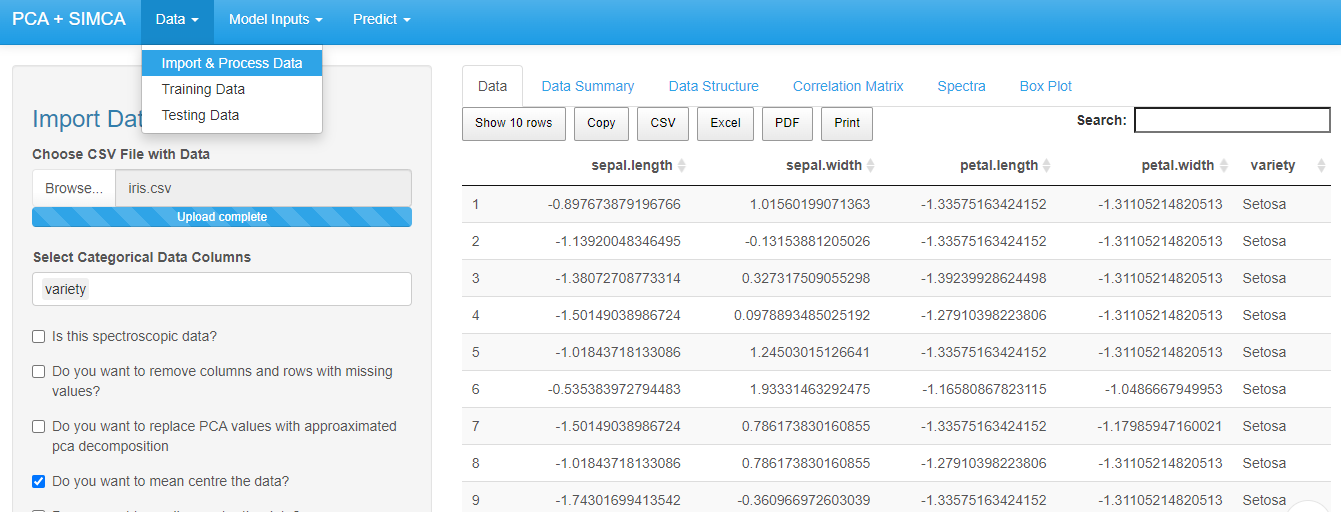
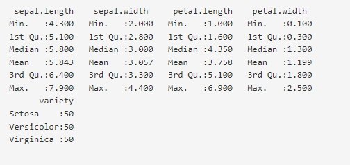
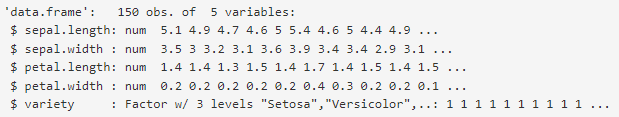
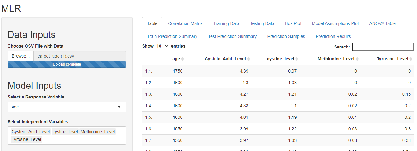
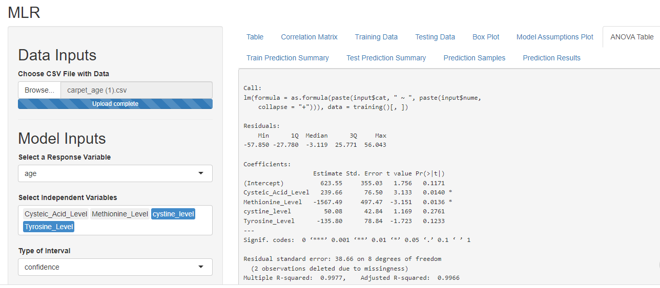
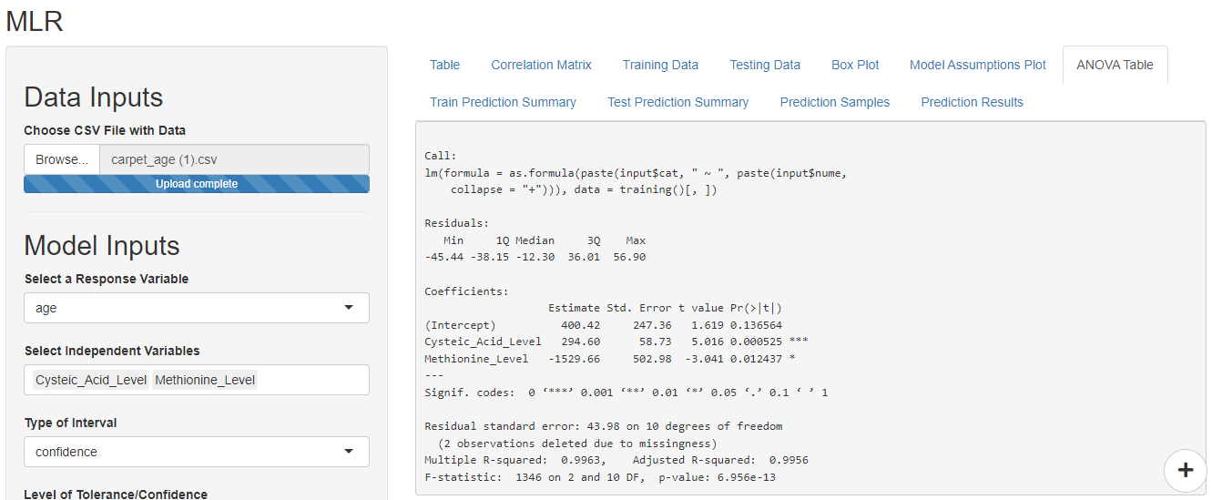
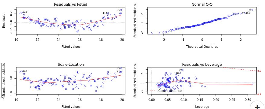
DataPandit is a cloud analytics solution for seasoned chemometrician, statisticians, machine learning engineers, and material scientists. It offers no coding machine learning solutions to build powerful predictive models and data visualizations. Here are some of the uses of DataPandit for data visualization:

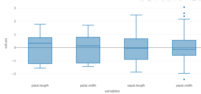
  • Box-plot: It shows the median, quartiles, and outliers of a dataset, providing a useful summary of the data’s central tendency and variability. 
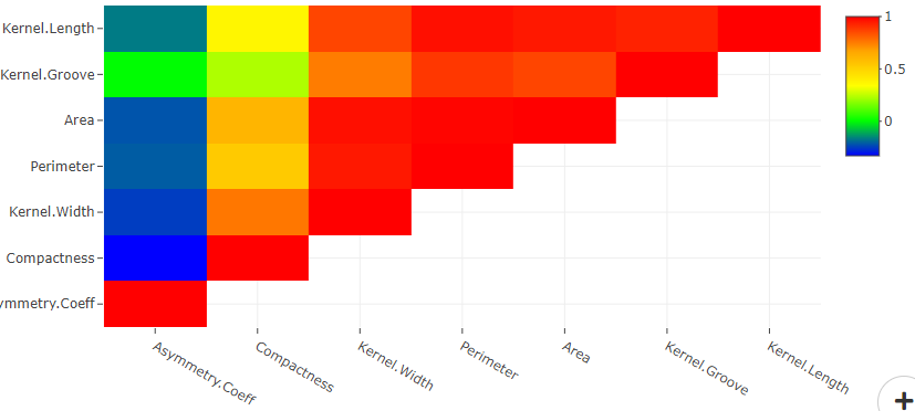
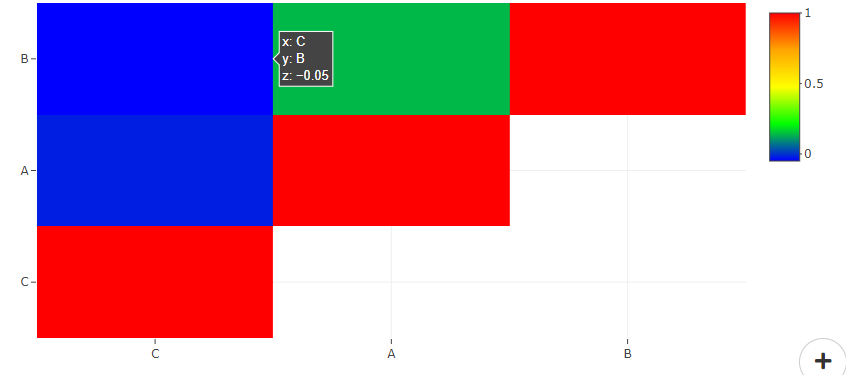
  • Correlation Matrix: It shows the strength and direction of relationships between multiple variables. It is a table that displays the correlation coefficients between each pair of variables in the form of a matrix. The coefficients range from -1 (perfect negative correlation) to 1 (perfect positive correlation), providing a visual representation of the strength of relationships. Users can visualize strength of relationships and multicollinearity within variables using correlation matrix.
  • Spectra Plots: distributed across a range of frequencies or wavelengths, allowing for the identification of peaks, troughs, and patterns in the material characterization data. They can be used to analyze and compare the spectra of different signals or substances, providing insights into their composition and behaviour.
  • PLS Plots: A PLS (Partial Least Squares) plot is a type of data visualization used in chemometrics and analytical chemistry. It is used to visualize the relationship between two sets of variables in a dataset, typically with the goal of reducing the dimensionality of the data while retaining as much information as possible. The PLS plot displays the variables in a reduced, two-dimensional space, allowing for the visual comparison and analysis of the relationships between variables. The plot is particularly useful for exploring complex, multivariate datasets and identifying patterns and relationships within the data.
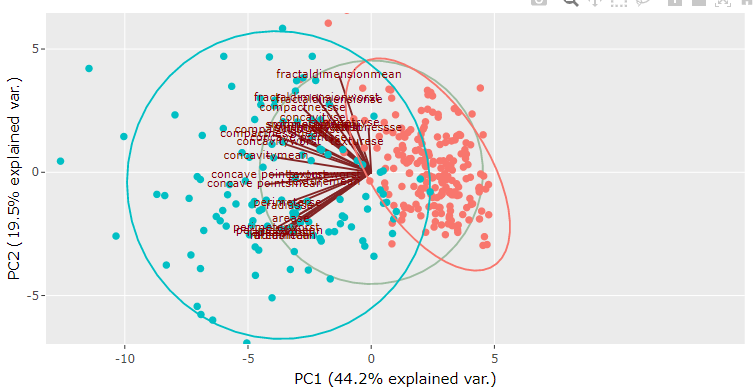
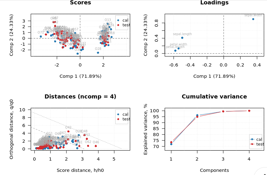
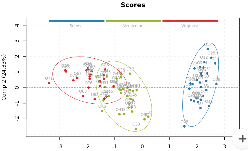
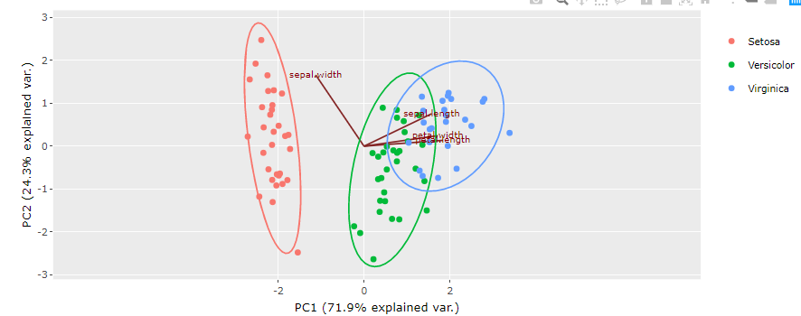
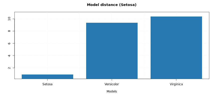
  • PCA Plots: A PCA (Principal Component Analysis) plot is a type of data visualization that represents high-dimensional data in a lower-dimensional space. It is commonly used in fields such as statistics, machine learning, and data science to visualize complex, multi-dimensional data. The PCA plot displays the data points in a two-dimensional space, representing the most important relationships between variables. The plot allows for the identification of patterns, trends, and clusters within the data, providing insights into the underlying structure of the data. It can also be used to reduce the complexity of large, high-dimensional datasets, making it easier to visualize and understand the relationships within the data.
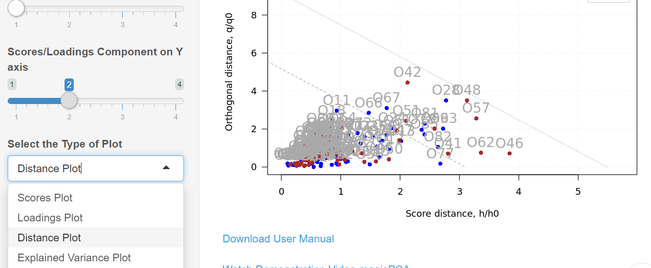
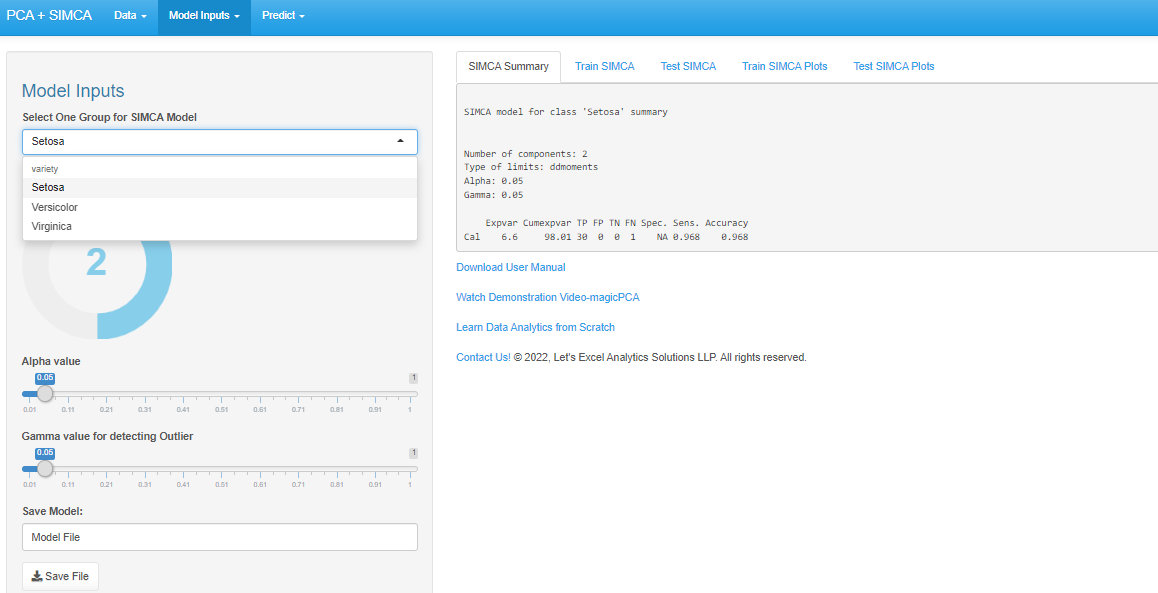
  • SIMCA Plots: A SIMCA (Soft Independent Modeling of Class Analogies) plot is a type of data visualization used in chemometrics and analytical chemistry. It is used to classify and visualize large, complex datasets by modelling the relationships between variables. The SIMCA plot displays the grouping patterns in data points in a two-dimensional space. The SIMCA plot can also be used to classify new data points based on their relationships with the modelled data.
  • LDA Plots: A LDA (Linear Discriminant Analysis) plot is a type of data visualization used in machine learning and data science to visualize the relationships between variables and class labels in a dataset. The plot represents the data in a lower-dimensional space, allowing for the visual comparison and analysis of the relationships between variables. The LDA plot is used to identify the most important variables for differentiating between class labels, and to visualize the relationships between variables and class labels in a clear and interpretable way. The plot can be useful for exploring the structure of a dataset, identifying patterns and trends, and improving the accuracy of classification models.
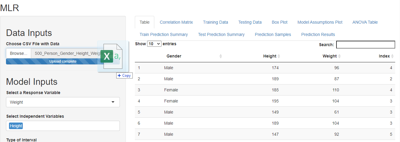
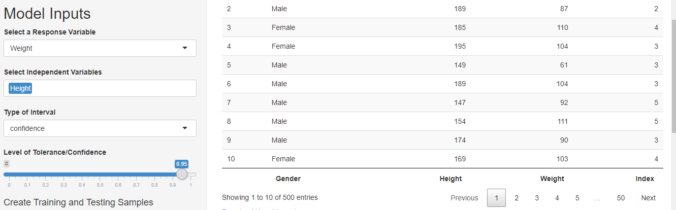
  • MLR Plots: A MLR (Multiple Linear Regression) plot is a type of data visualization used in statistics and data science to visualize the relationship between a dependent variable and one or more independent variables. The plot represents the relationship between the variables in a two-dimensional space, allowing for the visual comparison and analysis of the relationships between variables. The MLR plot can be used to identify patterns, trends, and outliers in the data, and to validate the assumptions of linear regression models. The plot is a useful tool for exploring the structure of a dataset, and for improving the accuracy of regression models used for prediction and forecasting.
  • WordCloud: A word cloud is a type of data visualization that displays the frequency of words in a text document as a cloud of words, where the size of each word represents its frequency. Word clouds are used to quickly identify the most frequently used words in a text, providing a visual representation of the overall theme and content of the text. They can be used in various fields such as social media analysis, sentiment analysis, content marketing, and text mining to understand the most important topics and trends in large amounts of unstructured text data. Word clouds are simple to create, easily interpretable, and provide a quick overview of the most important themes in a text.

27. ChartJS Data Visualization Platform

Chart.js is a free, open-source JavaScript library for data  visualization, which supports eight chart types: bar, line, area, pie (doughnut), bubble, radar, polar, and scatter. Although it is intended to be user-friendly and straightforward, it has the power to create intricate visualizations. It offers a broad variety of chart formats, including bar charts, line charts, pie charts, scatter plots, and many more. Since Chart.js is open-source, it can be used in both personal and professional projects without any limitations. In 2013, London-based web developer Nick Downie created the library, which is now community-maintained and is the second-most popular JavaScript charting library on GitHub by the number of stars, behind D3.js, despite being less customizable. Chart.js is regarded as one of the best data visualization libraries and renders in HTML5 canvas. It is offered with the MIT licence. Here are some of the features of Chart.js : 

  • Features : There are several commonly used chart kinds, plugins, and customization options available with Chart.js. In addition to a respectable selection of built-in chart kinds, you can utilise extra chart types that are maintained by the community. Additionally, a mixed chart can be created by combining other chart types (essentially, blending multiple chart types into one on the same canvas). Chart.js offers a wide range of customization options, including plugins for adding zoom, drag-and-drop functionality, and annotations.
  • Standard Configuration : Chart.js has a solid default configuration that makes it simple to get started and create a finished, production-ready app. Even if you don’t provide any options at all, there’s a good chance you’ll still get a pretty attractive chart. For instance, Chart.js has animations enabled by default, allowing you to draw attention to the data’s narrative right away.
  •  Multiple Integrations : Chart.js is compatible with all well-known JavaScript frameworks, including React, Vue, Svelte, and Angular, and it has built-in TypeScript typings. You have the option of using Chart.js directly or making use of well-maintained wrapper packages that enable a more natural interaction with your preferred frameworks.
  • Higher Developer Experience : More than 11,000 queries have the tag “chart.js” on Stack Overflow, GitHub Discussions, and Slack, where maintainers and community members avidly participate in discussions.
  • Canvas rendering : Unlike several other, primarily D3.js-based, charting libraries, which render as SVG, Chart.js renders chart elements on an HTML5 canvas. Chart.js is incredibly fast thanks to canvas rendering, especially when dealing with large datasets and intricate visualizations that would otherwise require thousands of SVG nodes in the DOM tree. However, canvas rendering forbids CSS styling, so you must use built-in options or develop a custom plugin or chart type to render everything as you prefer.
  • Smarter Performance : Large datasets work very well with Chart.js. You can avoid data parsing and normalisation by effectively ingesting such datasets using the internal format. As an alternative, the dataset can be configured to be sampled and shrunk before rendering. In the end, compared to SVG rendering, Chart.js’ canvas rendering is less demanding on your DOM tree. Additionally, tree-shaking support enables you to include only a small portion of the Chart.js code in your bundle, thereby minimising the bundle’s size and speeding up page load times.

28. Bokeh Data Visualization Platform

Bokeh is a Python data visualization package that offers fast interactive charts and graphs. Bokeh output is available in a variety of formats, including notebook, html, and servers. Apps written in Django and Flask can incorporate bokeh plots. For developing interactive visualizations for contemporary web browsers like Jupyter Notebook and Refinitiv CodeBook, use the Bokeh Python package. It enables users to generate attractive plots and charts that are ready to use almost without much fiddling. Since 2013, Bokeh has been in existence. It aims to deliver dynamic visualizations rather than static images in modern web browsers. Bokeh offers libraries for several different programming languages, including Python, R, Lua, and Julia. These libraries generate JSON data that is used by the Javascript library BokehJS to build interactive visualizations that can be viewed in current web browsers. Here are some extensive features of Bokeh : 

  • Flexible : Common plots can be easily created with Bokeh, but it can also handle unique or specialised use-cases.
  • Interactive : Devices and tools enabling you to explore “what if” scenarios or delve down into the specifics of your data with your audience.
  • Shareable : Plots, dashboards, and applications can be published as Jupyter notebooks or web pages.
  • Productive : Utilize all of the PyData tools you are already familiar with while working in Python.
  • Powerful : To handle complex or niche instances, you may always add your own JavaScript.
  • Open Source : Everything is BSD licenced and accessible on GitHub, including the Bokeh server.
  • Simple to complex visualizations : Bokeh offers a variety of user interfaces that cater to users of all skill levels. Users have a choice between using basic interfaces for quick, simple visualizations and sophisticated interfaces for more involved, highly customizable visualizations.
  • Support several output mediums : Jupyter Notebook and other contemporary web browsers are capable of displaying Bokeh’s output. Additionally, the output can be exported as an HTML file. Additionally, Bokeh allows for the development of interactive web applications that are run on the Bokeh server.

29. Gephi Data Visualization Platform

Java was used to create the visualization tool Gephi. It is primarily used to visualise, manipulate, and explore networks and graphs made from raw edge and node graph data. It is an open-source programme that is available for free. It is constructed on top of the Netbeans Platform and uses OpenGL as its visualization engine. It functions on Windows, Mac OS X, and Linux. For those interested in data science and graph exploration, it is a great tool. Although it works with graph data, it is comparable to Photoshop. In order to uncover hidden patterns, the user interacts with the representation and modifies the structures, shapes, and colours.The main objective is to make it possible for the user to form an opinion, find unnoticed patterns, and identify structural singularities and flaws while sourcing data.

  • Real-time Visualization of Data Network : Gephi provides live data and connection visualization. For pattern recognition, especially in big graphs, this is helpful. Additionally, the app allows you to add and modify 100,000 nodes and 1,000,000 edges, which makes it a good choice for big data analysis.
  • Layout Algorithm and Customization : You can also alter the graph’s design using Gephi. An algorithm for the app’s layout automatically connects the data you enter to one another and arranges it in a specific form or shape. The algorithm is created in a way that maximises the shape for readability of the graph. But you can easily alter it through the settings if you want it to take on a different shape.
  • Metrics and Statistics : A metrics system and statistics framework enable you to analyse data more quickly and thoroughly. It contains metrics for social network analysis (SNA), including shortest path, diameter, modularity, clustering coefficient, and pagerank. These metrics give you a clearer visual representation and a deeper comprehension of your data. Additionally, it has a data lab where you can store, search for, and work with your data using a user interface similar to Excel. The data laboratory will be simple to use for those with spreadsheet experience.
  • Data Export : You can export your data and network visualization from Gephi in PNG, PDF, or SVG formats. Prior to exporting, you can also preview your data using the vectorial preview module. You can save presets on the app to increase your productivity. Check out this article on the best tool for gathering, processing, and gaining insights to increase your knowledge of data analysis software.
  • Dynamic filtering : Using the network’s structure or data, filter the network to choose specific nodes and/or edges. Use an interactive user interface to instantly filter the network.

30. Raw Data Visualization Platform

RAWGraphs is an open source data visualization framework created with the intention of making it simple for anyone to visualise complex data. RAWGraphs is a spreadsheet application designed primarily for designers and visualization enthusiasts that aims to bridge the gap between vector graphics editors and spreadsheet programmes like Microsoft Excel, Apple Numbers, and OpenRefine (e.g. Adobe Illustrator, Inkscape, Sketch). DensityDesign Lab, working with Calibro, has been maintaining the project since its inception in 2013. RAWGraphs supports both copied and pasted text from other programmes (such as Microsoft Excel, TextWrangler, TextEdit,…) and delimiter-separated values (i.e. csv and tsv files). Visualizations based on the svg format can be quickly edited with vector graphics programmes for additional refinement or immediately embedded into web pages.

Here are some of the features : 

  • Open and free : As designers and/or developers working with data visualization, we must admit that without the existence of various free and open source solutions, our job would undoubtedly be very different. We consider a number of already-existing projects, such as Gephi, Open Refine, D3js, or Scriptographer, which we were able to utilise for free and which influenced our work methods and technical expertise. We wanted to give something back by enabling individuals to experiment with visualization and improve their data literacy for nothing.
  • Privacy Maintained : Although RAWGraphs Visualization is a web application, only the web browser will process the data you enter. Nobody will see, touch, or copy your data because no server-side actions or storages are used.
  • Optimized output : Your visualizations can be exported from RAWGraphs as.svg files. To alter them as you see fit, open them in your preferred vector graphics programme. No longer are PDFs or raster pictures hard to modify.

31. Grafana Data Visualization Platform

Grafana is an open source interactive data-visualization platform created by Grafana Labs that enables users to view their data through charts and graphs combined into one dashboard (or multiple dashboards!) for simpler interpretation and understanding. Regardless of where your data is stored—traditional server environments, Kubernetes clusters, different cloud services, etc.—you can query it and set alerts on your metrics. This makes it simpler for you to analyse the data, spot patterns and discrepancies, and ultimately improve the efficiency of your processes. Grafana was created on the basis of open standards and the idea that data should be available to everyone within an organisation, not just a select few. 

Here are some of the features : 

  • Panels: Histograms and heatmaps are both used. graphs to geomaps You can visualise your data however you want with Grafana’s quick and adaptable visualization tools.
  • Plugins: With Grafana plugins, you can link your teams’ resources and tools. Without requiring you to migrate or ingest your data, data source plugins connect to already-existing data sources via APIs and render the data in real time.
  • Alerts: With Grafana Alerting, you can easily centralise and consolidate all of your alerts by creating, managing, and silencing them all from one straightforward user interface.
  • Transformations: You can use transformations to rename, condense, combine, and calculate across various queries and data sources.
  • Annotations: Add detailed events from various data sources to graphs. You can view the complete event metadata and tags by hovering over events.
  • Panel editor: With a unified user interface for configuring data options across all of your visualizations, the panel editor makes it simple to configure, customize, and explore all of your panels.
  • Collaborate: The foundation of effective collaboration is shared information access. enables you to quickly and easily distribute Grafana dashboard insights throughout your organization, team, and the world.

Conclusion

Data visualization is the only method that can guarantee the visual profiling of large datasets. Data visualization has become more dependable over time by becoming more flexible and robust. Users can navigate the complexities by using visualization to access data, derive useful insights, and choose an appropriate course of action.

We are aware of the significance of data visualization in business, as well as its advantages and various methods for creating visual formats. Without this crucial step, analytics cannot process any further steps. I, therefore, draw the conclusion that data visualization can be used in any industry and profession. Data visualization is also necessary because the vast majority of big, unstructured data cannot be comprehended by human brains alone. These data sets must be transformed into a format that we can easily comprehend. To identify trends and relationships, graphs and maps are essential if we are to gain understanding and reach a more accurate conclusion. The future of data visualization will continue to enable visualizers by offering solid and trustworthy tools for data journalism, self-service BI, social media integration, and mobile support.

Looking for Cloud Analytics Partner? Get in touch to explore how Lets Excel Analytics Solutions LLP can help you.

Cloud Analytics: Top 9 Deciding Factors for Finalizing Your Business Partner out of your data

Cloud Analytics:Top 9 Deciding Factors for Finalizing Your Business Partner

Introduction

Cloud Analytics is the process of analyzing and managing data stored in the cloud. It involves the use of cloud computing technologies to store, process, and analyze large amounts of data from various sources. This allows organizations to access, process, and analyze their data from anywhere, at any time, using any device with an internet connection. In addition it also enables organizations to reduce their IT infrastructure costs, as they don’t need to maintain their own data centers and servers. Instead, the data is stored and processed in the cloud, which is managed and maintained by a third-party provider.

Cloud analytics includes a variety of technologies and tools, including data warehousing, data mining, machine learning, and data visualization. Without the need for significant IT resources or experience, these solutions allow firms to get insights and make informed decisions based on their data.

Overall, cloud analytics gives businesses a flexible, scalable, and affordable way to manage and analyze their data, empowering them to enhance operations and make better decisions.

The future of data management and analysis is cloud analytics, and success depends on selecting the appropriate partner.

The top nine things we must consider before finalizing our cloud analytics partner are:

#1 Experience and Expertise in Cloud Analytics

A cloud analytics partner’s experience and knowledge are essential considerations because they affect the caliber of services provided. A partner with substantial expertise has demonstrated history of overcoming several obstacles and is equipped to handle any tricky scenarios that may develop throughout your project. Contrarily, expertise denotes a comprehensive knowledge of cloud analytics, data management, and data analysis. To help you maximize your investment in analytics, a knowledgeable partner can offer the technical expertise and direction you need. A skilled and experienced partner can make sure that your project is a success and that you get the outcomes you want in a timely and economical manner

#2 Data Security  

Data security is paramount when choosing a cloud analytics partner because it determines the protection of sensitive information and prevents unauthorized access. In the cloud, data is stored and processed remotely, making it vulnerable to security threats, such as cyber-attacks, data breaches, and theft. When choosing an analytics partner, you need to consider the following aspects of data security:

  • Encryption: To avoid unauthorized access, the analytics cloud provider should encrypt all data, both in transit and at rest.
  • Access Controls: To limit access to data and the danger of data breaches, access controls should be in place. User authentication, role-based access, logging, and auditing are all included in this.
  • Data Backup and Recovery: To guarantee that your data is always safe and recoverable in the event of a disaster, your cloud analytics provider should have a strong data backup and recovery plan in place.
  • Compliance is essential to guarantee data security and protection. Examples of these standards and laws include the General Data Protection Regulation and the Payment Card Industry Data Security Standard.
  • Security Monitoring and Incident Response: To swiftly identify and address any security incidents, your cloud analytics partner should have a proactive security monitoring program in place.

You may safeguard your sensitive data and reduce the possibility of data breaches, theft, and other security concerns by confirming that your cloud analytics partner has robust data security mechanisms in place. As a result, you can rest easy and keep the confidence of your stakeholders and clients.

#3 Scalability

Because it affects the solution’s capacity to change in response to changing needs over time, scalability is a crucial consideration when selecting a cloud analytics partner. As your organization develops, a scalable cloud analytics solution will be able to handle increases in data volume, complexity, and processing needs. By doing this, you can be certain that you won’t outgrow the solution and will keep enjoying the advantages of cloud analytics as your demands alter.

You may manage enormous and complex data sets with the assistance of a partner who provides scalable analytics solutions, while also having the freedom to add new features and integrations as required. This can assist you in avoiding downtime, lowering costs, and making sure you can maximize your investment in cloud analytics.

A scalable solution will also assist you in reducing the chance of vendor lock-in because you will be able to quickly move to another solution without losing any of your data or investment if necessary.

#4 Integration with Other Tools

When selecting a cloud analytics partner, integration with other technologies is crucial since it affects how simple and effective it will be to integrate cloud analytics into your current technological stack. By merging your data with additional tools, integration enables you to maximize the value of your current data sources, systems, and processes.

Your data workflow may be streamlined, human work can be minimized, and errors can be reduced with the assistance of a cloud analytics partner who provides seamless connectivity with other solutions. You won’t need to invest time and resources in manual data integration and reconciliation, which can lead to quicker and more accurate insights as well as lower expenses. A unified picture of your data and the avoidance of data silos are two further benefits of integration that can promote data-driven decision-making.

To ensure seamless integration and data sharing, it’s crucial to select a partner who has experience connecting with the technologies you already use and who provides extensive APIs and connectors. This will ensure that your team can operate successfully and efficiently and that you get the most value out of your cloud analytics investment.

#5 Customer Support

The level of help and direction you receive before, during, and after the implementation of your cloud analytics solution depends on the customer service provided by the partner you choose for cloud analytics. When you need help, a good customer support team can assist you promptly and dependably. They can also assist you in overcoming any potential obstacles or technical challenges.

An effective cloud analytics implementation can mean the difference between a frustrating one and a failure. You can maximize the return on your cloud analytics investment and guarantee that you have the tools you need to use the system successfully by working with a partner who provides thorough customer support. Your cloud analytics solution’s most recent features and capabilities, as well as any market developments that can have an impact on how you use the product, can all be kept up to date with the help of customer support. This can assist you in seizing fresh chances and staying current.

Look for cloud analytics partners who provide a variety of support methods, such as phone, email, chat, and online resources, when comparing potential partners. This will make it more likely that you will have access to the support you require when you need it and that you may receive rapid, efficient assistance.

#6 Cost of the Cloud Analytics Platform

Cost is an important consideration when selecting a cloud analytics partner because it affects how much it will cost to implement and operate the service. Understanding the costs involved and selecting a partner who provides a solution that works within your budget is crucial because a cloud analytics solution can be an investment in your company.

Take into account the price of the software, hardware, and services while assessing cloud analytics partners. Included in this are licensing fees, setup costs, and ongoing support and maintenance expenditures. As these are significant elements that may affect the total cost of ownership of a cloud analytics system, you should also take these expenses into account.

Additionally, it’s crucial to select a partner with transparent pricing so you can assess the value of your investment and assess the expenses of other partners. A solution’s long-term cost-effectiveness and possible return on investment (ROI) from your cloud analytics investment should also be taken into account.

You can still get the advantages of cloud analytics while saving money, improving productivity, and enabling data-driven decision-making with the aid of a cost-effective cloud analytics solution. You can choose a cloud analytics partner who offers a solution that matches your budget and fulfills your goals by carefully weighing the costs involved.

#7 User-Friendliness

User-friendliness is a crucial consideration when selecting a cloud analytics partner because it affects how simple and available the solution is for your team to utilize. Regardless of their level of technical expertise, your team can use a cloud analytics solution effectively and efficiently if it is easy to use.

Look for solutions with a straightforward and user-friendly interface as well as customized dashboards, reports, and visualizations when assessing cloud analytics partners. A user-friendly solution can save you time, lessen the learning curve involved in utilizing a new tool, and enable you to quickly gain insights from your data and take action on it.

Your team will be more inclined to utilize your cloud analytics solution if it is simple and easy to use, therefore having a user-friendly solution will help you enhance acceptance and utilization. This can enable data-driven decision-making throughout your business and help you get the most out of your investment in cloud analytics.

Select a cloud analytics partner that provides simple solutions and gives training and tools to assist your team in implementing and maximizing the product. This will ensure that your team can soon start realizing the benefits of your investment in cloud analytics and that you have a system that is accessible and simple to use.

#8 Data Privacy and Compliance for Cloud Analytics

The security and protection of your sensitive data in the cloud are determined by data privacy and compliance, making them crucial considerations when selecting a cloud analytics partner. Data breaches and illegal access to sensitive information can have major repercussions, therefore organizations must take data privacy and compliance very seriously in today’s digital world.

Look for cloud analytics partners who provide strong security features like encryption, access limits, and multi-factor authentication when evaluating potential partners. You should also take into account where your data is located and any relevant local data privacy laws and regulations.

Additionally, pick a cloud analytics partner that complies with pertinent industry norms and laws, such as the Health Insurance Portability and Accountability Act (HIPAA) in the US and the General Data Protection Regulation in the EU. By doing so, you’ll be able to protect your data and comply with all applicable rules and laws.

You can protect your sensitive data and lower the risk of data breaches and unauthorized access by working with a cloud analytics partner that has robust data privacy and compliance controls. By doing this, you can have peace of mind knowing that your investment in analytics is safe and legal.

#9 Long-Term Commitment

The level of assistance and investment you can anticipate from your partner over time is determined by their long-term commitment, which is an important consideration when selecting a cloud analytics partner. It’s critical to select a partner who is dedicated to giving you the tools, support, and innovation you need to succeed when investing in a cloud analytics solution for your company because it can be a long-term investment in your company.

Look for analytics partners that provide a long-term commitment to your business, such as a dedicated account manager, frequent software updates and upgrades, and a dedication to customer support, when comparing potential partners. You can maximize the return on your analytics investment and get the assistance you need to overcome obstacles and seize new possibilities by working with a partner who is dedicated to your long-term success. 

Choose a cloud analytics partner as well that has a track record of growth and innovation, since this can help you keep ahead of the curve and benefit from emerging technology. You can maintain your relevance and competitiveness and accomplish your company’s aims and objectives with the assistance of a partner who is dedicated to long-term innovation.

The level of support and investment you may anticipate over time is determined by a partner’s long-term commitment, which is a crucial consideration when choosing an analytics partner. Select a partner that is dedicated to your success and can offer you the tools, encouragement, and creative ideas you require to be successful.

Conclusion

Choosing the right analytics partner is important because it can have a significant impact on the success of your analytics initiatives and the results you achieve. The right analytics partner can provide you with the tools, resources, and support you need to get the most out of your data, and can help you turn data into insights and action.

  •  Improved data insights: You can maximize the value of your data and transform it into insights that advance your company’s operations with the aid of a competent analytics partner. You can recognize trends, forecast outcomes, and make data-driven decisions with the proper analytics tools and assistance.
  •  Increased efficiency: Your analytics operations can be automated and streamlined with the aid of a reputable analytics partner, saving you time and lowering human labor requirements. You can accomplish better results more quickly by concentrating on more strategic efforts as a consequence.
  •  Better decision-making: Making superior, data-driven decisions that support your company’s goals and objectives are possible with the right analytics tools and assistance. Making judgments based on information and insights rather than hunches or speculation will enable you to discover and rank the most crucial prospects.
  •  Increased competitiveness: You can stay ahead of the curve and utilize the newest technology and capabilities by picking the ideal analytics partner. This might provide you with a competitive edge in your market and help you stay relevant and competitive.
  •  Better security: You can guarantee the security and privacy of your sensitive data with the proper analytics partner. The proper partner can give you the resources and tools you need to protect your data as well as assist you in adhering to all applicable rules and laws.

So, the success of your analytics activities and the outcomes you obtain depends on your choice of analytics partner. With the appropriate partner, you can fully realize the potential of your data and transform it into insights that advance your company.

The success of your data management and analysis activities depends on your choice of analytics partner. Before making a final decision, take into account these nine variables to make sure you select the best partner for your company.

Looking for Cloud Analytics Partner? Get in touch to explore how Lets Excel Analytics Solutions LLP can help you.

Correlation Vs Causation

Correlation Vs Causation

The subtle difference in ‘Correlation Vs Causation’ is very important for budding data analysts. Often we get so excited with the patterns in the data that we forget to evaluate if it is a mere correlation or if there is a definite cause. It is very easy to get carried away with the idea of giving some fascinating Insight to our clients or cross-functional teams. In this blog post, let us talk briefly about the difference between correlation and Causation.


Causation

The word Causation means that there is a cause-and-effect relationship between the variables under investigation. The cause and effect relationship causes one variable to change with change in other variables. For example,  if I don’t study, I will fail the exam. Alternatively, if I study, I will pass the exam. In this simple example, the cause is ‘study,’ whereas ‘success in the exam’ is the effect. 

Correlation does not imply causation

Correlation

The word correlation means a statistical relationship exists between the variables under investigation. The statistical relationship indicates that the change in one variable is mathematically related to the change in other variables. The variable with no casual relationship can also show an excellent statistical correlation. For example, my friend found out that a candidate’s success in an exam is positively correlated with the fairness of the candidate’s skin—the fairer the candidate, the better the success.

I am sure you will realize how it doesn’t make sense in the real world. My friend got carried away for sure, right?

Take a Way

Always look for Causation before you start analyzing the data. Remember, Causation and correlation can coexist at the same time. However, correlation does not imply Causation. It is easy to get carried away in the excitement of finding a breakthrough. But it is also essential to evaluate the scientific backing with more information. 

So, how do you cross-check if the causation really exists? What are the approaches you take? Interested in sharing your data analysis skills for the benefit of our audience? Send us your blog post at info@letsexcel.in. We will surely accept your post if it resonates with our audience’s interest.

Need multivariate data analysis software? Apply here to obtain free access to our analytics solutions for research and training purposes!

PCA

Your Ultimate Guide for PCA with DataPandit

Principal component analysis (PCA)  is an unsupervised classification method. However, the PCA method in DataPandit cannot be called an unsupervised data analysis technique as the user interface is defined to make it semi-supervised. Therefore, let’s look at how to perform and analyze PCA in DataPandit with the help of the Iris dataset.

Arranging the data 

 There are some prerequisites for analyzing data in the magicPCA application as follows:

  • First, the data should be in .csv format. 
  • The magicPCA application considers entries in the first row of the data set as column names by default.
  • The entries in the data set’s first column are considered row names by default.
  • Each row in the data set should have a unique name. I generally use serial numbers from 1 to n,  where n equals the total number of samples in the data set. This simple technique helps me avoid the ‘duplicate row names error.’
  • Each column in the data set should have a unique name.
  • As magicPCA is a semi-supervised approach, you need to have a label for each sample that defines its class.
  • There should be more rows than the number of columns in your data.
  • It is preferable not to have any special characters in the column names as the special characters can be considered mathematical operations by the magicPCA algorithm.
  • The data should not contain variables with a constant value for all the samples.
  • The data should not contain too many zeros. 
  • The data must contain only one categorical variable

Importing the data set

The process of importing the data set is similar to the linear regression example. You can use the drag and drop option or the browse option based on your convenience. 

Steps in data analysis of PCA

Step 1: Understanding the data summary

After importing the data, it makes sense to look at the minimum, maximum, mean, median, and the first and third quartile values of the data to get a feel of the distribution pattern for each variable. This information can be seen by going to the ‘Data Summary’ tab beside the ‘Data’ tab in the main menu.

Step 2: Understanding the data structure 

You can view the data type for each variable by going to the ‘Data Structure’ tab beside the ‘Data Summary’ tab. Any empty cells in the data will be displayed in the form of NA values in the data structure and data summary. If NA values exist in your data, you may use data pre-treatment methods in the sidebar layout to get rid of them.

Step 3: Data Visualization with boxplot 

As soon as the data is imported, the boxplot for the data gets automatically populated. Boxplot can be another valuable tool for understanding the distribution pattern of variables in your data set. You can refer to our earlier published article to learn how to use boxplot.

You can mean center and scale data set to normalize the distribution pattern of the variables.

The following picture shows the Iris data when it is mean-centered.

 The picture below shows the Iris data when it is scaled after mean centering.

Step 4: Understanding the multicollinearity

Multicollinearity of the variables is an essential prerequisite for building a good PCA model. To know more about multicollinearity and how to measure it read our article on Pearson’s correlation Coefficient and how to use the multicollinearity matrix.

Step 5: Divide the data in the training set and testing set

After importing the data,  the training and testing data set automatically gets selected based on default settings in the application. You can change the proportion of data that goes in the training set and testing set by Increasing or decreasing the value for the ‘Training Set Probability’ in the sidebar layout, as shown in the picture below.

Suppose the value of the training set probability is increased. In that case, a larger proportion of data goes into the training set whereas, if the value is decreased, the relatively smaller proportion of data remains in the training set. For example, if the value is equal to 1, then 100% of the data goes into the training set living testing set empty.

As a general practice, it is recommended to use the training set to build the model and the testing set to evaluate the model. 

Step 6: Select the column with a categorical variable

This is the most crucial step for building the PCA model using DataPandit. First, you need to select the column which has a categorical variable in it. As soon as you make a selection for the column which has a categorical variable, the model summary, plots, and other calculations will automatically appear in under the PCA section of the ‘Modal Inputs’ tab in the Navigation Panel.

Step 7: Understanding PCA model Summary

The summary of PCA can be found below the model summary tab. 

The quickest way to grasp information from the model summary is to look at the cumulative explained variance, which is shown under ‘Cumexpvar,’ and the corresponding number of components shown as Comp 1, Comp 2, Comp 3, and so on. The cumulative explained variance describes the percentage of data represented by each component. In the case of the Iris data set, the first component describes 71.89% of the data (See Expvar). At the same time, the second component represents 24.33% of the data. Together component one and component two describe 96.2 2% of the data. This means that we can replace the four variables which describe one sample in the Iris data set with these two components that describe more than 95% of the information representing that sample in the data set. And this is the precise reason why we call principal component analysis as a dimensionality reduction technique.

Step 8: Understanding PCA summary plot

The PCA summary plot shows scores plot on the top left side, loadings plot on the top right side, distance plot on the bottom left side, and cumulative variance plot on the bottom right side. The purpose of the PCA summary plot is to give a quick glance at the possibility of building a successful model. The close association between calibration and test samples in all the plots indicates the possibility of creating a good model. The scores plot shows the distribution of data points with respect to the first two components of the model.

In the following PCA summary plot, the Scores plot shows two distinct data groups. We can use the loadings plot to understand the reason behind this grouping pattern. We can see in the loading plot that ‘sepal width’ is located father from the remaining variables. Also, it is the only variable located at the right end of the loadings plot. Therefore we can say that the group of samples located on the right side of the scores plot is associated with the sepal width variable. These samples have higher sepal width as compared to other samples. To reconfirm this relationship, we can navigate to the individual scores plot and loadings plot.

Step 9: Analyzing Scores Plot in PCA

The model summary plot only gives an overview of the model. It is essential to take a look at the individual scores plot to understand the grouping patterns in more detail. For example, in the model summary plot, we could only see two groups within the data. However, in the individual scores plot we can see three different groups within the data: setosa, versicolor, and virginica. The three groups can be identified with three different colors indicated by the legends at the top of the plot.

Step 10: Analyzing loadings plot in PCA

It is also possible to view individual loadings plot. To view it, select ‘Loadings Plot’ option under the ‘Select the Type of Plot’ in the sidebar layout.

The loadings plot will appear as shown in the picture below. If we compare the individual scores plot and loading plot, we can see that the setosa species samples are far away from the verginica and the Versicolor species. The location of the Setosa species is close to the location of sepal width on the loadings plot, which means that the setosa species has higher sepal with as compared to the other two species.

Step 11: Analyzing distance plot in PCA

You can view the distance plot by selecting the ‘Distance Plot’ option under the ‘Select the Type of Plot’ in the sidebar layout. The distance plot is used to identify outliers in the data set. If there is an outlier, it will be located far away from the remaining data points on this plot. However, the present data set does not have any outliers. Hence we could not spot any. Ideally, you should never label a sample as an outlier unless and until you know a scientific or practical reason which makes it an outlier.

Step 12: Analyzing explained variance plot in PCA

You can view explained variance plot by selecting the ‘Explained Variance Plot’ option under the ‘Select the Type of Plot’ in the sidebar layout. It shows the contribution of each principal component in describing the data points. For example, in this case, the first principal component represents 71.9 % of the data whereas the second principal component describes 24.3% of the data. This plot is used to find out the number of principal components that can optimally describe the entire data. It is expected that the optimal number of components should be lower than the total number of columns in your existing data set because the very purpose of a PCA model is to reduce the dimensionality of the data. In the case of the Iris data, we can say that two principal components are good enough to describe more than 95% of the data. Also, addition of more principal components does not result in a significant addition to the information (<5%). Pictorially,  we can also come down to this conclusion by identifying the elbow point on the plot. The elbow point, in this case, is at principal component number 2. 

Step 13: Analyzing biplot in PCA 

The biplot for PCA shows scores and the loading information on the same plot. For example, in the following plot, we can see that loadings are shown in the form of lines that originate from a common point at the center of the plot. At the same time, scores are shown as scattered points. The direction of the loadings line indicates the root cause for the location of the samples on the plot. In this case, we can see that setosa samples are located in the same direction as that of the sepal width loading line, which means that setosa species have higher sepal width than the other two species. It reconfirms our earlier conclusion drawn based on individual scores and loadings plot. 

Step 14: Saving the PCA model

If you are satisfied with the grouping patterns in the PCA model, then you can go on to build an individual PCA model for each categorical level. Therefore, in the case of the Iris data, we need to make 3 PCA models, namely,  setosa, virginica, and Versicolor. To do this, we need to navigate to the SIMCA option under the ‘Model Inputs’ option in the navigation panel.

After going to the SIMCA option, select the species for which you want to build the individual model using the drop-down menu under ‘Select One Group for SIMCA Model.’ As soon as you select one group, the SIMCA model summary appears under ‘SIMCA Summary’ in the main menu. Depending on the  cumulative explained variance shown under the ‘Simca Summary’, select the number of components for SIMCA using the knob in the sidebar layout. Save individual model files for each categorical level using ‘Save File’ button under the ‘Save Model’ option in the sidebar layout.

Step 16: Uploading PCA Models for SIMCA predictions

You can upload the saved individual model files using the ‘Upload Model’ feature in the sidebar layout.

To upload the model files, browse to the location of the files in your computer, select the ‘All files’ option in the browsing window, Press’ ctrl’, and select all the model files for the individual models as shown in the picture below. 

Step 17: Understanding the result for the train set

As soon as the individual model files are uploaded, the predictions for the train set and test set populate automatically. Go to the ‘Train SIMCA’ tab to view the predictions for the train set . You can see the predictions for individual sample by looking at the table which displays on the screen under the ‘Train SIMCA’ tab. In the prediction table, 1 indicates the successful classification of the sample into the corresponding category represented by column name. However, it may not be convenient to check the classification of each sample in the training data. Therefore, to avoid this manual work, you can scroll down to see the confusion matrix.

The confusion matrix for the train set of Iris data is shown in the figure below. The rows of the confusion matrix represent the actual class of the sample, whereas the columns of the confusion Matrix represent the predicted class of the sample. Therefore,  the quickest way to analyze the confusion matrix is to look at the diagonal elements and non-diagonal elements of the matrix. Every non-diagonal element in the confusion matrix is misclassified and contributes to the classification error. If there are more non-diagonal elements than the diagonal elements in your confusion Matrix, then that means the models cannot distinguish between different classes in your data. For example, in the case of Iris, data following confusion matrix shows that four Versicolor samples are misclassified as Verginaca, and one sample from each class could not be classified into any species. The model’s accuracy can be calculated by performing a sum of correctly classified samples and dividing it by the total number of samples in the training set. In this case, accuracy will be equal to the sum of diagonal elements divided by the total number of samples in the train set. At the same time, the misclassification error can be found by subtracting the accuracy from 1.

The closer the accuracy value to 1, the better the model’s predictability.

The Confusion Matrix can be pictorially seen by going to the ‘Train SIMCA plot’ option in the main menu. The plot shows the three species in three different colours, represented by the legend at the top.

You can view cooman’s plot by selecting Cooman’s Plot’ or the ‘Model Distance Plot’ option in the ‘Model Plot Inputs’ in the sidebar layout.

Cooman’s plot shows squared orthogonal distance from data points to the first two selected SIMCA (individual PCA) models. The points are color grouped according to their respective class in the case of multiple result objects.

‘Model Distance Plot’ is a generic tool for plotting distance from the first model class to other class models.

Step 18: Understanding the result for the test set

The process of analyzing the results for the test set is the same as that of the train set. The results for the test set can be found under the ‘Test SIMCA’ and the ‘Test SIMCA Plot.’

Step 19: Predict the unknown

If you are happy with the train set and test set results, you can go ahead and navigate to the ‘Predict’ option in the Navigation Panel. Here you need to upload the file with samples from unknown class and the individual models using the process similar to step 16. And the Prediction Plot will populate automatically.

Conclusion 

Principal Component Analysis is a powerful tool for material characterization, root cause identification, and differentiating between the groups in the data. In addition, DataPandit’s magicPCA makes it possible to predict of the unknown class of data with the help of a dataset with known classes of samples.

Need multivariate data analysis software? Apply here for free access to our analytics solutions for research and training purposes!

Linear regression with examples

Linear Regression with Examples

Introduction to linear regression

Whenever you come across a few variables that seem to be dependent on each other, you might want to explore the linear regression relationship between the variables.  linear regression relationship can help you assess:

  • The strength of the relationship between the variables
  •  Possibility of using predictive analytics to measure future outcomes

This article will discuss how linear regression can help you with examples. 

Advantages of linear regression


Establishing the linear relationship can be incredibly advantageous if measuring the response variables is either time-consuming or too expensive. In such a scenario, linear regression can help you make soft savings by reducing the consumption of resources. 

Linear regression can also provide scientific evidence for establishing a relationship between cause and effect.  Therefore the method is helpful in submitting evidence to the regulatory agencies to justify your process controls. In the life-science industry, linear regression can be used as a scientific rationale in the quality by design approach.

Types of linear regression

There are three major types of linear regression as below:

  1. Simple linear regression: Useful when there is one independent variable and one dependent variable
  2. Multiple linear regression:  Useful when  there are multiple independent variables and one dependent variable

Both types of linear regression methods mentioned above need to meet assumptions for Linear regression. You can find these assumptions in our previous article here

This article will see one example of simple linear regression and one example of multiple linear regression.

Simple linear regression

To understand how to model the relationship between one independent variable and one dependent variable, let’s take the simple example of the BMI dataset. We will explore if there is any relationship between the height and weight of the individuals. Therefore, our Null hypothesis is that ‘There is no relationship between weight and height of the individuals’.


Step I


Let’s start by Importing the data. To do this drag and drop your data in the Data Input fields. You can also browse to upload data from your computer.

DataPandit divides your data into train set and test set using default settings where (~59%) of your data gets randomly selected in the train set and the remaining goes into the test set. You have the option to change these settings in the sidebar layout. If your data is small you may want to increase the value higher than 0.59 to include more samples in your train set.

Step II

The next step is to give model inputs. Select the dependent variable as the response variable and the independent variable as the predictors. I wanted to use weight as a dependent variable and height as an independent variable hence I made the selections as shown in the figure below.


Step III

Next refer to articles for Pearson’s correlations matrix, box-plots, and models assumptions plot for pre-modeling data analysis. In this case, Pearson’s correlation matrix for two variables won’t display as it is designed for more than two variables. However, if you still wish to see it you can select the height and weight both as independent variables and it will display. After you are done, just remove weight from the independent variables to proceed further.

Step IV

The ANOVA table displays automatically as soon as you select the variables for the model. Hence, after the selection of variables you may simply check the ANOVA table by going to the ANOVA Table tab as shown below:

The p-value for Height in the above ANOVA table is greater than 0.05 which indicates that there are no significant differences in weights of individuals with different heights. Therefore, we fail to reject the null hypothesis. The R squared value and Adjusted R Squared value are also close to zero indicating that the model may not have a high prediction accuracy. The small F- statistic also supports the decision to reject the null hypothesis.

Step V

If you have evidence of a significant relationship between the two variables, you can proceed with train set predictions and test set predictions. The picture below shows the train set predictions for the present case. You can consider this as a model validation step where you evaluating the accuracy of predictions. You can select confidence intervals or prediction intervals in the sidebar layout to understand the range in which future predictions may lie. If you are happy with the train and test predictions you can save your model using the ‘save file’’ option in the sidebar layout.

Step VI

It is the final step in which you use the model for future prediction. In this step you need to upload the saved file using the Upload Model option in the sidebar layout. Then you need to add the data of predictors for which you want to predict the response. In this case, you need to upload the CSV file with the data for the model to predict weights. While uploading the data to make predictions for unknown weights, please ensure that you don’t have the weights column in your data. 

Select the response name as Weight and the predictions will populate along with upper and lower limits under the ‘Prediction Results’ tab.

Multiple linear regression

The steps for multiple regression are the same as that of Simple linear regression except that you can choose multiple variables as independent variables. Let’s take an example of detection of the age of carpet based on Chemical levels. The data contains the Age of 23 Old Carpet and Wool samples, along with corresponding levels of chemicals such as Cysteic Acid, Cystine, Methionine, and Tyrosine. 

Step I

Same as simple linear regression.

Step II

In this case, we wish to predict the age of the carpet hence, select age as the response variable. Select all other factors as independent variables.

Step III

Same as simple linear regression.

Step IV

The cystine level and tyrosine level do not have a significant p-value hence they can be eliminated from the selected independent variables to improve the model.

The Anova table automatically updates as soon as you make changes in the ‘Model Inputs’. Based on the p-value, F-statistic, multiple R-square and adjusted R square the model shows a good promise for making future predictions.


Step V

Same as simple linear regression.

Step VI

Same as simple linear regression.

Conclusion

Building linear regression models with DataPandit is a breeze. All you need is well-organized data with a strong scientific backing. Because correlation does not imply causation!

Need multivariate data analysis software? Apply here to obtain free access to our analytics solutions for research and training purposes!

Linear Regression Assumptions

Top 7 Linear Regression Assumptions You Must Know

The theory of linear regression is based on certain statistical assumptions. It is crucial to check these regression assumptions before modeling the data using the linear regression approach. In this blog post, we describe the top 7 assumptions and you should check in DataPandit before analyzing your data using linear regression. Let’s take a look at these assumptions one by one.

#1 There is a Linear Model

The constant terms in a linear model are called parameters whereas the independent variable terms are called predictors for the model. A model is called linear when its parameters are linear. However, it is not necessary to have linear predictors to have a linear model. 

To understand the concept, let’s see how a general a linear model can be written? The answer is as follows:

Response = constant + parameter * predictor + … + parameter * predictor
Or

Y = b o + b1X1 + b2X2 + … + bkXk

In the above example, it is possible to obtain various curves by transforming the predictor variables (Xs)  using power transformation, logarithmic transformation, square root transformation, inverse transformation, etc. However, the parameter must remain linear always. For example, the following equation represents a linear model because the parameters ( b o,b1, and b2) are linear and only X1 is raised to the power of 2.

Y = b o + b1X1 + b2X12

In DataPandit the algorithm automatically picks up the linear model when you try to build a linear or a multiple linear regression relationship. Hence you need not check this assumption separately.

#2 There is no multicollinearity

If the predictor variables are correlated among themselves, then the data is said to have a multicollinearity problem.  In other words, if the independent variable columns in your data set are correlated with each other, then there exists multicollinearity within your data. In DataPandit we use Pearson’s Correlation Coefficient to measure the multicollinearity within data. The assumption of no multicollinearity in the data can be easily visualized with the help of the collinearity matrix

Figure 1: High level of multicollinearity in the data

Figure 2: No multicollinearity in the data

#3 Homoscedasticity of Residuals or Equal Variances

The linear regression model assumes that there will be always some random error in every measurement. In other words, no two measurements are going to be exactly equal to each other. The constant parameter (b o ) in the linear regression model represents this random error. However linear regression model does not account for systematic errors which may occur during a process. 

Systematic error is an error with a non-zero mean. In other words, the effect of the systematic error is not reduced when the observations are averaged. For example, loosening of upper and lower punches during the tablet compression process results in lower tablet hardness over a period of time. The absence of such an error can be determined by looking at the Residuals versus fitted values plot in DataPandit. In presence of systematic error, the residuals Vs Fitted values plot will look like Figure 3.

If the Residuals are equally distributed on both sides of the trend line in the residual versus fitted values plot as in Figure 4, then it means there is an absence of systematic error. The idea is that equally distributed residuals or equally distributed variances will average out themselves to zero. Therefore, one can safely assume that measurements only have a random error that can be accounted for by the linear model and there is the absence of systematic error. 

Figure 3: Residuals Vs Fitted Exhibiting Heteroscedasticity

Figure 4: Residuals Vs Fitted Exhibiting Homoscedasticity

#4 Normality of Residuals

It is important to confirm the normality of residuals for reaffirming the absence of systematic errors as stated above.  It is assumed that if the residuals are normally distributed they are unlikely to have an external influence (systematic error) that will cause them to increase or decrease consistently over a period of time. In DataPandit you can check the assumption for normality of residuals by looking at the Normal Q-Q plot

Figure 5 and Figure 6 demonstrate the case when the assumption of normality is not met and the case when the assumption of normality is met respectively.

Figure: 5 Residuals do not follow Normal Distribution

Figure 6: Residuals follow Normal Distribution

#5 Number of observations > number of predictors

For a minimum viable model,

Number of observations= Number of Predictors + 1

However greater the number of observations better the model performance. Therefore, to build a linear regression model you must have more observations than the number of independent variables (predictors)  in the data set.

For example, if you are interested in predicting the density based on mass and volume, then you must have data from at least three observations because in this case, you have two predictors namely, mass and volume. 

#6 Each observation is unique

It is also important to ensure that each observation is independent of the other observation.  Meaning each observation in the data set should be recorded/measured separately on a unique occurrence of the event that caused the observation. 

For example, if you want to include two observations to measure the density of a liquid with 2 Kg mass and 2 l volume, then you must perform the experiment twice to measure the density for the two independent observations. Such observations are called replicates of each other. It would be wrong to use same measurement for both observations, as you will disregard the random error.

#7 Predictors are distributed Normally

This assumption ensures that you have evenly distributed observations for the range of each predictor. For example, if you want to model the density of a liquid as a function of temperature, then it will make sense to measure the density at different temperature levels within your predefined temperature range. However, if you make more measurements at lower temperatures than at higher temperatures then your model may perform poorly in predicting density at high temperatures. To avoid this problem it will make sense to take a look at the boxplot for checking the normality of predictors. Read this article to know how boxplots can be used to evaluate the normality of variables. For example, in Figure 7, all predictors except ‘b-temp’ are normally distributed.

Figure 7: Checking Normality assumption for the predictors

Closing

So, this was all about assumptions for linear regression. I hope that this information will help you to better prepare yourself for your next linear regression model. 

Need multivariate data analysis software? Apply here to obtain free access to our analytics solutions for research and training purposes!