Data Visualization

Data Visualization using Box-Plot

Data visualization is the first step in data analysis. DataPandit allows you to visualize boxplots as soon as you segregate categorical data from numerical data. However, the box plot does not appear until you uncheck  ‘Is this spectroscopic data?’ option in the sidebar layout, as shown in Figure 1. 

Figure 1: Boxplot in DataPandit

The box plot is also known as ‘Box – Whisker Plot’. It provides 5-point information, including the minimum score, first (lower) quartile, median, third (upper) quartile, and maximum score. 

When Should You Avoid Boxplot for Data Visualization?

The box plot itself provides 5-point information for data visualization. Hence, you should never use a box plot to visualize data with less than five observations. In fact, I would recommend using a boxplot only if you have more than ten observations.

Why Do You Need Data Visualization?

If you want a DataPandit user, you might just ask, ‘Why should I visualize my data in first place? Wouldn’t it be enough if I just analyze my model by segregating the response variable/categorical variable in the data?’ The answer is, ‘No’ as data visualization is the first step before proceeding to data modeling. Box plots often help you determine the distribution of your data.

Why is Distribution Important for Data Visualization?

If your data is not normally distributed, you most likely might induce bias in your model. Additionally, your data may also have some outliers that you might need to remove before proceeding to advanced data analytics approaches. Also, depending on the data distribution, you might want to apply some data pre-treatments to build better models.

Now the question is how data visualization can help to detect these abnormalities in the data? Don’t worry, we will help you here. Following are the key aspects that you must evaluate while data visualization.

Know the spread of the data by using a boxplot for data visualization

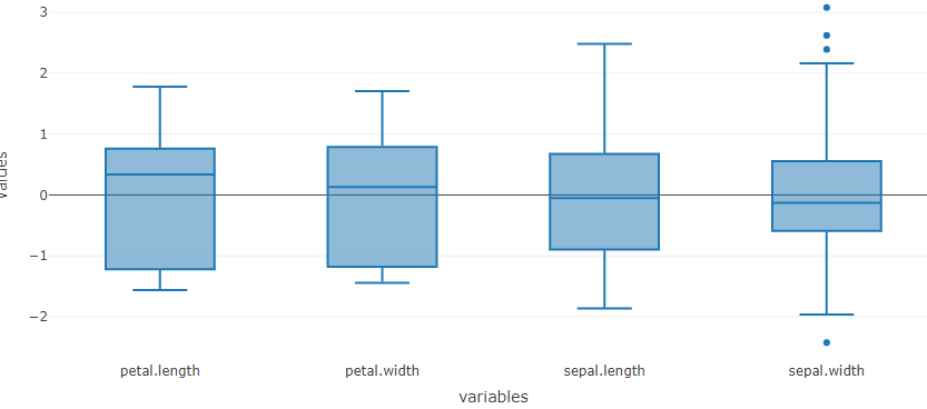
Data visualization can help you determine the spread of the data by looking at the lowest and highest measurement for a particular variable.  In statistics,  the spread of the data is also known as the range of the data. For example, in the following box plot, the spread of the variable ‘petal.length’ is from 1 to 6.9 units.

Figure 2: Iris raw data boxplot 

Know Mean and Median by using a boxplot for data visualization

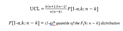
Data visualization with boxplot can help you quickly know the mean and median of the data. The mean and median of normally distributed data coincide with each other. For example, we can see that the median petal.length is 4.35 units based on the boxplot. However, if you take a look at the data summary for the raw data, then the mean for petal length is  3.75 units as shown in Figure 3. In other words, the mean and median do not coincide which means the data is not normally distributed.

Figure 3: Data summary for Iris raw data

Know if your data is Left Skewed or Right Skewed by using boxplot for data visualization

Data visualization can also help you to know if your data is skewed using the values for mean and median. If the mean is greater than the median, the data is skewed towards the right. Whereas if the mean is smaller than the median, the data is skewed towards the left. 

Alternatively, you can also observe the interquartile distances visually to see where most of your data lie. If the quartiles are uniformly divided, you most likely have normal data.

Understanding the skewness can help you know if the model will have a bias on the lower side or higher side. You can include more samples to achieve normal distribution depending on the skewness.

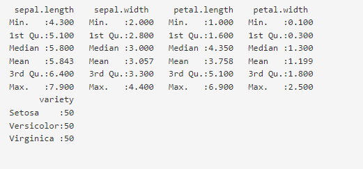
Know if the data point is an outlier by using a boxplot for data visualization

Data visualization can help identify outliers. You can identify outliers by looking at the values far away from the plot. For example, the highlighted value (X1, max=100) in Figure 4 could be an outlier. However, in my opinion, you should never label an observation as an outlier unless you have a strong scientific or practical reason to do so.

Figure 4: Spotting outlier in boxplot

Know if you need any data pre-treatments by using boxplot for data visualization

Data visualization can help you know if your data needs If the data spread is too different for different variables, or if you see outliers with no scientific or practical reasons, then you might need some data pre-treatments. For example, you can mean center and scale the data as shown in Figure 5 and Figure 6 before proceeding to the model analysis. You can see these dynamic changes in the boxplot only in the MagicPCA application.

Figure 5: Iris mean-centered data boxplot

Figure 5: Iris mean-centered data boxplot

x

Conclusion

Data visualization is crucial to building robust and unbiased models. Boxplots are one of the easiest and most informative ways of visualizing the data in DataPandit. Boxplots can be a very useful tool for spotting outliers, and understanding the skewness in the data. Additionally, they can also help to finalize the data pre-treatments for building robust models.

Need multivariate data analysis software? Apply here to obtain free access to our analytics solutions for research and training purposes!

Correlation Matrix

How to use the Correlation Matrix?

The correlation matrix in DataPandit shows the relationship of each variable in the dataset with every other variable in the dataset. It is basically, a heatmap of Pearson correlation values between corresponding variables.

For example, in the correlation matrix above, the first element on X-axis is high_blood_pressure while that on the Y-axis is high_blood_pressure too. Therefore, it should show a Perfect correlation with itself with Pearson’s correlation coefficient value of 1. If we refer to the legend at the top right side of the correlation matrix, we can see that Red Color shows the highest value (1) in the heatmap while the blue color shows the lowest value in the heatmap. Theoretically, the lowest possible value for Pearson’s correlation is -1. However, the lowest value in the heatmap may vary from data to data. However, every heatmap will show the highest correlation value of 1 owing to the presence of the diagonal elements.

The diagonal elements of the correlation matrix are the relationship of each variable with itself and hence show a perfect relationship (Pearson’s Correlation Co-efficient of 1).

However, it doesn’t make much sense to see the relationship of any variable with itself. Therefore, while analyzing the correlation matrix treat these diagonal elements as points of reference. 

You can hover over the matrix elements to see the X and Y variable along with the numerical value of Pearson’s correlation coefficient to know the exact coordinates.

There are options to zoom in, zoom out, add toggle spikes, autoscale and save the plot at the top right corner of the plot. Toggle spikes draws perpendicular lines on the X and Y axis and shows the exact coordinates with value of Pearson’s correlation.

In the above correlation matrix, the toggled spike lines show that diabetes and serum_creatinine have a Pearson’s correlation coefficient of -0.05 indicating no relationship between the two variables.

Read our blog post here to know more about Pearson’s correlation. Apply here if you are interested in obtaining free access to our analytics solutions for research and training purposes? 

Pearson's correlation Matrix

What is Pearson’s Correlation Co-efficient?

Introduction

Pearson’s correlation is a statistical measure of the linear relationship between two variables. Mathematically,  it is the ratio of covariances of the two variables And the product of their standard deviations. Therefore the formula for Pearson’s correlation can be written as follows:

Pearson's Correlation Coefficient Formula
Mathematical Expression for Pearson’s Correlation

The result for Pearson’s correlation always varies between -1 and + 1. Pearson’s correlation can only measure linear relationships and it does not apply to higher-order relationships which are Non-linear in nature.

Assumptions for Pearson’s correlation

Following are the assumptions for proceeding to data analysis using Pearson’s correlation:

  1. Independent of the case: Pearson’s correlation should be measured on cases that are independent of each other. For example, it does not make sense to measure Pearson’s correlation for the same variable measured in two different units or with the same variable itself. even if  Pearson’s correlation is measured for a variable that is not independent of the other variable there is a high chance that the correlation will be a perfect correlation of 1. 
  2. Linear relationship: The relationship between two variables can be assessed for its linearity by plotting the values of variables on a scatter diagram and checking if the plot yields a relatively straight line. The picture below demonstrates the difference between the trend lines of linear relationships and nonlinear relationships.
Learn Vs Non-linear relationship
Linear relationship Vs. Non-linear relationship

  1. Homoscedasticity: Two variables show homoscedasticity if the variances of the two variables are equally distributed. It can be evaluated by looking at the scatter plot of Residuals. The scatterplot of the residuals should be roughly rectangular-shaped as shown in the picture below.
Homoscedasticity Vs. Heteroscedasticity

Properties of Pearson’s Correlation

  • Limit: Coefficient values can range from +1 to -1, where +1 indicates a perfect positive relationship, -1 indicates a perfect negative relationship, and a 0 indicates no relationship exists..
  • Pure number: Pearson’s correlation comes out to be a dimensionless number because of its formula. Hence its value remains unchanged even with changes in the unit of measurement.  For example, if one variable’s unit of measurement is in grams and the second variable is in quintals, even then, Pearson’s correlation coefficient value does not change.
  • Symmetric: The Pearson’s correlation coefficient value remains unchanged for the relationship between X and Y or Y and X, hence it is called a Symmetric measure of a relationship.

Positive correlation

Pearson’s correlation coefficient indicates a positive relationship between two variables if its value ranges from 0 to 1. This means that when the value of one of the variables among the two variables increases, the value of the other variable increases too.

An example of, a positive correlation is a relationship between the height and weight of the same individual. Because naturally the increase in height is associated with the increase in length of bones of the individual, and the larger bones would contribute to the increased weight of the individual. Therefore, if Pearson’s correlation for height and weight data of the same individual is calculated, then it would indicate a positive correlation. 

Negative correlation

Pearson’s correlation coefficient indicates a negative relationship between two variables if its value ranges from 0 to -1. This means that when the value of one of the variables among the two variables increases, the value of the other variable decreases.

An example of a negative correlation between two variables is the relationship between height above sea level and temperature. The temperature decreases as the height above the sea level increase therefore there exists a negative relationship between these two variables.

Degree of correlation:

The strength of the relationship between two variables is measured by the value of the correlation coefficient. The statisticians use the following degrees of correlations to indicate the relationship:

  1. Perfect relationship: If the value is near ± 1, then there is a perfect correlation between the two variables as one variable increases, the other variable tends to also increase (if positive) or decrease (if negative).
  2. High degree relationship: If the correlation coefficient value lies between ± 0.50 and ± 1, then there is a strong correlation between the two variables.
  3. Moderate degree relationship: If the value of the correlation coefficient lies between ± 0.30 and ± 0.49, then there is a medium correlation between the two variables.
  4. Low degree relationship: When the value of the correlation coefficient lies below + .29, then there is a weak relationship between the two variables.
  5. No relationship: There is no relationship between two variables if the value of the correlation is 0.

Pearson’s Correlation in Multivariate Data Analysis

In addition to finding relationships between two variables, Pearson’s correlation is also used to understand the multicollinearity in the data for multivariate data analysis. This is because the suitability of the data analysis method depends on the multicollinearity within the data set. If there is high multicollinearity within the data then Multivariate Data Analysis techniques such as Partial Least Square Regression, Principal Component Analysis, and Principal Component Regression are most suitable for modeling the data. Whereas, if the data doesn’t show a multicollinearity problem, then it can be used for data analysis using multiple linear regression and linear discriminant analysis. That is the reason why you should take a good look at your Pearson correlation Matrix while choosing data analytics models using the DataPandit platform. Read this article to know more about how to use the correlation matrix in DataPandit.

Conclusion

Pearson’s correlation coefficient is an important measure of the strength of the relationship between two variables. Additionally, it can be also used to assess the multicollinearity within the data.

Did you know that Let’s Excel Analytics Solutions provides free access to its analytics SaaS applications for research and training purposes? All you have to do is fill up this form if you are interested.

Finding the Data Analytics Method that Works for You

Last week I met John, a process expert who works at a renowned cosmetic manufacturing company. John was pretty frustrated over a data scientist who could not give him a plot using the data analytics technique of his choice. He was interested in showing grouping patterns in his data using PCA plots.

When I got to know John was dealing with a data problem, I got curious. So I asked him, can I see the data? And he gladly shared the data with me, looking for a better outcome.

But it was in vain. Even I couldn’t create a PCA plot out of John’s data. The reason was that John was trying to make a PCA plot using a dataset that could be easily visualized without a dimensionality reduction method. In other words, it was data that could be easily visualized in a two-dimensional space without using any machine learning algorithm.

But then why was John after the PCA? After we talked for a few more minutes, John said that he saw this method in a research paper and believed it would solve his problem. This explanation helped me to identify the root cause. At the same time, it triggered me to write down this article. I am writing this article for all the Johns who need a helping hand in selecting the most appropriate analytics approach to solve your problem.

Data Analytics Method for 2-Dimensional Data

Try the simplest approach first. If it can be done in Excel, then do it in excel! Taking a lesson from John’s experience, always try to do the simplest step first. Ask yourself, ‘Can I plot this in Excel?’ If the answer is yes, just do it right away. You can either choose to just plot the data for exploratory analysis or build a simple linear regression model for quantitative modeling depending on the use case.

Data Analytics Method for Slightly Dimensional Data

These are simple but tricky cases where the problem you are trying to solve may not need dimensionality reduction, but plotting the data wouldn’t be as simple as plotting an XY chart in Excel. In such cases, you can get help from data analysts who can suggest statistical software like Minitab and JMP to select the appropriate data analytics technique. In case you can’t access them, you can hire your data analyst friend to write a code for you to visualize that data. An example of such a exploratory data analytics method is shown below:

Pharma-Life Science Case Studies
This graphic helps in visualizing the Particle Size Distribution of Material as it is getting processed in a similar manner for three different batches. It was a simple yet slightly tricky data with 4 columns (Median Diameter-Batch 1, Median Diameter-Batch 2, Median Diameter-Batch 3, and TimePoint)

Data Analytics Method for Highly Dimensional Data with Grouping Patterns

Suppose your data is highly dimensional with too many rows and columns that can not be plotted on an XY plot or even with the help of your data analyst friend, then you need a data analytics method for dimensionality reduction. For example methods like PCA or LDA can help you manage such data. However, the grouping pattern in the data can be visualized if you can assign a group to each observation in your data set. These methods don’t only give you an option of visualizing your data but also give you a chance to determine the group of an unknown sample.

PCA plot
It is a PCA plot that shows two groups in the data. The group labeled ‘Yes’ is miscible with the drug and the group labeled ‘No’ is immiscible with the drug. In the future, this model can predict if an unknown material is miscible with the drug or not.

For example, suppose you used data from four mango species by assigning them to four different groups corresponding to their species. In that case, you can train a PCA or LDA model to predict the species of a mango sample whose species is not yet determined.

Similar to the Mango problem, here the LDA model predicts the species of an Iris flower.

However, it should be noted that LDA models do better when the variables are not highly correlated with each other. Whereas the PCA model works better with multilinear data.

The multicollinearity or correlations between variables occurs when one variable increases or decreases with other variables. For example, if the height and weight of individuals are collected in the form of variables that describe an individual, then it is likely that an increase in height will result in an increase in weight. Therefore, we can say that the data has a multicollinearity problem in such a case.

The multicollinearity of variables can be judged on the basis of this heatmap. The higher the positive relationship between variables closer the color to the red, the higher the negative relationship between variables closer the color is to blue. If the color is closer to yellow then there is no collinearity issue.

Data Analytics Method for Highly Dimensional Data with Numerical Response

When highly dimensional data is being represented in the form of a number instead of a group, then quantitative data analytics techniques such as PCR, PLS, and MLR come to your rescue. Out of these, PCR and PLS work best on highly correlated data, whereas MLR works best for non-correlated data that follows normality assumptions. That is the reason PCR and PLS (and even PCA) techniques work well with sensor data from spectroscopes.

Quantitative Anatylics Techniques
PCR, PLS, and MLR methods can predict the quantitative value of the response. The model performance is judged based on the closeness of the predicted value with the reference value in the known samples. If the predicted and reference values are aligned well as shown in the above picture then the model can be used for future predictions of unknown samples.

If you are using DataPandit’s smartMLR application, then you can even build a linear regression model using 2-dimensional data as it can handle small data (widthwise) as well as big data (widthwise).

All these quantitative data analytics methods help you predict future outcomes in numerical format. For example, if you have data of 10 different metals alloyed by mixing in varying proportions and the resultant tensile strength of the alloy. Then, you can build a model to predict the tensile strength of future alloy that can be made by changing the proportion of component alloys.

To Summarize

More data analytics techniques can be mentioned here, but I am mentioning the ones available for the DataPandit users. However, the key takeaway is that whenever you face a data analytics problem, then only start searching for a solution. Don’t be like John, who figured out the solution and then tried to fit his problem into the solution. My two cents would be to let the data analytics method work for you rather than you working for the data analytics method! Don’t stop here, share it with all the Johns who would like to know this!

What is Data Analytics as a Service?

Introduction

Data Analytics is very diverse in the solutions it offers. It covers a range of activities that add value to businesses. It has secured a foothold in every industry that ever existed. Eventually carving a niche for itself known as Data Analytics as a Service (DAaaS)

DAaaS is an operating model platform where a service provider offers data analytics services that add value to a clients’ business. Companies can use DAaaS platforms to analyze patterns within the data using ready to use interface. Alternatively, companies can also outsource the whole data analytics task to the DAaaS providers.  

How does DAaaS Help Organizations?

Have you ever wondered how CEOs make big decisions? A potential game-changer that makes large companies trade high on the NYSENASDAQ, etc. A surprising statistic shows that organizations rely on intuition-based decision-making. High stake business decisions are made solely based on gut feelings and speculative explanations. However, there is an element of uncertainty associated with such decisions as long as that uncertainty is assessed. Data Analytics offers solutions on how data can be used to mitigate the associated risks and enable well-grounded decision-making. 

Organizations collect data constantly on competitors, customers, and other factors that contribute to a business’s competitive advantage. This data helps them in strategic planning and decision-making. But the million-dollar question is whether organizations choose to build data analytics capabilities or outsource to Data Scientists with deep technical expertise. The answer to this question lies in the digital maturity of the organization. Most organizations prefer focusing on the core businesses rather than donning multiple hats at the same time. More and more organizations are turning to outsource their Data Science work to make most of their data. DAaaS furnishes the most relevant information extracted from data to help organizations make the best possible data-driven decisions. 

Why Organizations Should Outsource Data Analytics

For many reasons, organizations, particularly start-ups, are turning to outsourced Data Analytics. Outsourcing has long been undertaken as a cost-cutting measure and is an integral part of advanced economies. Some of the main reasons why companies should opt for outsourcing Data Analytics include: 

  • Organizations can focus on core business.
  • Outsourcing offers flexibility as the service can be availed only when it is required. 
  • Organizations don’t have to maintain a large infrastructure for data management.
  • Organizations can advantage from high-end analytics services.
  • Outsourcing has lower operational costs.
  • It improves risk management.

What Can DAaaS Do for You?

 Data Import

Data import is the first step towards building actionable insights. It helps organizations import data from their systems into the DAaaS platform. Data is an asset for organizations as it influences their strategic decision-making. Managing data is vitally important to ensure data is accurate, readily available, and usable by the organization. 

Translate Data into Actionable Insights

Data is useful only when it is acted upon to derive useful insights that add value. Connecting and joining dots between data is important to put the facts and figures together. Data is nothing if the dots between them can’t be connected. The outcome of connecting and joining helps us answer one of the following bottom-line questions. 

  1. What happened? Descriptive Analysis
  2. Why happened? Diagnostic Analysis
  3. What is likely to happen? Predictive Analysis
  4. What should be done? Prescriptive Analysis

Testing of ‘Trained Models’

Testing the accuracy of a model is the primary step in the implementation of the model. To test the accuracy of the model, data is divided into three subsets: Training Data, Testing Data, and Validation Data. A model is built on the training dataset that comprises a larger proportion of the data. Training data is subsequently run against test data to evaluate how the model will predict future outcomes. Validation data is used to check the accuracy and efficiency of the model. The validation dataset is usually the one not used in the development of the model. 

Prediction and forecasting using ‘Trained Models’

Future events can be predicted using analytical models that has come to be known as predictive analytics. The analytical models are fit (also known as trained) using historical data. But such models constantly add data and eventually improve the accuracy of their prediction. Predictive analytics has been using advanced techniques like Machine Learning and Artificial Intelligence to improve the reliability and automation of the prediction. 

Deploy Proven Analytical ‘Models’

Training a model is not quite as difficult as deploying a model. Deploying a model is the process of utilizing the trained model for the purpose it was developed for. It involves how the end-user interacts with the prediction of the model. The end-user can interact with the model using web services, a mobile application, and software. This is the phase that reaps the benefits of predictive modeling adding value to the business needs. 

Conclusion

Data Analytics as a Service (DAaaS) companies enables access to high-tech resources without actually owning them. Organizations can reach out to DAaaS providers for their services only when it is required, eventually cutting huge costs on maintaining Data Analytics infrastructure and rare to find Data Scientists. This has enabled us to usher into a new world of the Gig Economy. 

Let’s Excel Analytics Solutions LLP is a DAaaS company that offers a solution to all your Data Analytics problems. 

Curious to know more?

Internet Of Things-Few Insightful Facts

Introduction

The internet has revolutionized our modern society. It has simplified everything that we do. It has brought us all the good things of the world at our fingertips. There has been a wave of internet transformation lately. The traditional internet has evolved into the Internet of Things(IoT) by convergence into diversified technologies. This evolution has broadened its applications beyond general consumer usage and has driven dramatic changes at the industrial platforms. This blog tries to explain the basic idea behind IoT and its applicability in diverse fields.

What is the Internet of Things?

IoT is defined as the network of objects (IoT devices) embedded with computing devices that enable them to exchange data over the internet. These objects range from general consumer items to industrial applications. The IoT for industrial applications is also known as the Industrial Internet of Things (IIoT).  

How does the IoT work?

An IoT device is comprised of three main components: sensor, microprocessor, and communication hardware. The sensor constantly collects data from the environment. The microprocessor analyzes the collected data using machine learning algorithms. And the communication hardware is used to communicate with other IoT devices. Most of the IoT devices are controlled remotely through an app or software.

Applications of IoT

  • Home improvement devices

IoT has realized the concept of smart homes. Most of the home appliances can be programmed remotely using IoT features. This has enhanced the quality of human life significantly. It includes air conditioning and lighting systems, alarm and home security systems, refrigerators, robotic vacuum cleaners, and TVs, etc., all of which can be remotely controlled by an app installed on a smartphone.

  • IoT in industrial manufacturing

The implementation of IoT has ushered the manufacturing industry into a new era of smart factories. It has numerous applications in manufacturing right from supply chain management through core manufacturing operations to distribution of the finished product. IoT-enabled manufacturing employs advanced sensors that collect data across all the critical operations of the production flow. This data is fed into cloud computing to get valuable insights that eliminate waste and unnecessary reworks and encourage continuous process improvements. It also alerts operators of any potential breakdowns and performs preventive maintenances to avert downtimes.

  • IoT in healthcare

Many wearable devices are available that monitor vital signs like blood pressure, heart rate, calorie checks, etc. These devices are used by Athletes to track the intensity of the workout sessions. These bands can also track the sleep patterns of individuals. Some of these devices have automatic fall detection systems that can predict the likelihood of fainting particularly in the case of elderly people. In case of a potential fall situation, these devices can send SOS signals to family members or ambulatory services.

The physicians have also been using IoT smart devices to track the health status of patients. The device can alert physicians of any need for immediate medical attention. In addition,  physicians can also track patient’s adherence to treatment regimes and monitor the prognosis of the treatment.

  • Smart cities

Smart-Cities employ advanced technologies to build highly efficient and sustainable infrastructure. For example, Smart lightings can drastically reduce energy consumption by switching ON and OFF when someone walks past them. Air quality tools continuously monitor air pollution data in real-time data and forecast emissions. Sensors installed on streets can give real-time updates on traffic management. 

  • IoT in the automotive industry

Nowadays, Autonomous cars are installed with IoT sensors to eliminate human errors and judgments during driving. This can avoid car accidents and makes driving safe and comfortable.

Advantages of IoT

  1. IoT automates processes and improves the quality of life.
  2. Enables the access of information from anywhere at any time in the world.
  3. It enables communication between devices without any human intervention.
  4. It Saves capital, resources, and time.
  5. Enhances efficiency and productivity.

Disadvantages of IoT

  • As IoT devices are connected over a network, it predisposes them to security attacks.
  • IoT devices continually share a substantial amount of data; it risks personal information of the users
  • IoT systems are very complex and are vulnerable to failures.

Future of IoT

According to IoT analytics, there were over 4.7 billion devices connected to the IoT in 2016. These figures are expected to grow up to 11.6 billion by the end of 2021. It is estimated that these numbers are anticipated to increase up to 21 billion by 2025. The total market value of IoT was worth $389 billion in 2020 and it is forecasted to rise to $1 trillion in 2030.

Conclusion

Internet of Things has transformed and simplified everything we do right from our household activities to commercial manufacturing operations. It has automated processes without human interventions. Owing to the vast applicability of IoT almost all the devices that we use are turning smart today.

Curious to know more?

Examples of Internet of Things

Introduction

The application of the Internet of Things (IoT) is widely spread in all walks of our life. It creates an ecosystem where everything is connected and controlled using an application. This connectedness and remote control simplify and make our lives better. The basic idea behind the concept of the Internet of Things is already discussed in our previous blog. In this blog, we are going to discuss the various applicabilities of IoT in diverse fields. We will be focusing on the examples of the Internet of Things and its applications in retail, food, healthcare, manufacturing, and general consumer.

Various Examples of Internet of Things are Mentioned Below:

Retail analytics

  • Internet of Things (IoT) has made possible the automation of warehouses. Warehouse automation refers to the process of movement of inventory in and out of the inventory without human intervention.  IoT has enabled automatic replenishment of inventory by raising purchase and tracking it as well. This feature is known as demand-aware warehousing. Autonomous mobile robots have taken over the physical movement of inventory from their location to the shipping area. This movement is automatically captured by ERP.
  • Imagine a situation when a long queue of customers is waiting for billing and the machine is down. This discourages customer turn-over and eventually affects the business. Alternatively, the breakdown of a deep freezer storing temperature-sensitive commodities could prove a huge loss to the business. To reduce such untimely downtimes, IoT could be leveraged to signal preventive maintenance needs in the first place.
  • IoT allows smart transportation of goods through GPS tracking and routing of trucks. It also solves the challenges posed by the transportation of temperature-sensitive goods. The temperature tracking could be performed in real-time and the potential risks could be mitigated before actually happening.
  • IoT uses video monitoring of customer traffic to get insight into potential buyers. If a customer is dwelling over the product, a store associate could be sent to attend to the customer to increase the likelihood of a sale. This video monitoring could also be used for training store associates. This feature also allows monitoring potential problems, like shop-lifting, and take timely appropriate actions.

Cold Chain in the Food Industry 

IoT has solved the basic challenges experienced by the food and beverage industry: 

  1. Food safety and traceability and
  2. Food wastage and cost.
  • IoT-based sensors in the cold chain provide temperature, humidity, and light monitoring that offers unparalleled safety and traceability right from the farms to the retail grocery stores.  All this data is available on the cloud and can be accessed anywhere over the internet. This forms an indispensable tool for an effective food safety strategy.
  • Most of the food wastes in the food industry are attributed to gaps in supply chain management. IoT has been proved to reduce food waste significantly by filling in gaps in the supply chain. IoT enables automated data collection that provides real-time insight into effective supply chain management. This could drastically reduce the costs incurred due to food wastage.

IoT Assisted Patient Care

  • Many IoT devices are available in the market that enables online monitoring of patient vital signs. This monitoring allows tracking the real-time health status of a patient and alerting patients in case of potential emergencies. In case of real emergencies, these devices can send SOS to hospitals and ambulatory services. 
  • There are very important application of IoT in elderly care. IoT-based automatic fall devices can predict the potential fainting or emergency and take immediate actions accordingly.
  • Physicians are also using IoT devices for monitoring patients away from the hospital. For example, the technology monitoring the pacemaker implanted into the patient can provide meaningful insights into its working and potential failures.

General Consumer IoT

  • Most of the appliances that we use today have IoT features. This includes air conditioners, refrigerators, vacuum cleaners, televisions, etc. All these devices are connected by a gateway and remotely controlled by a mobile app. For example, an air conditioner could be made to cool the house remotely before actually reaching home. 
  • The IoT can also be used to efficiently utilize energy at homes and reduce wastage in energy consumption. For example, smart home energy management systems allow real-time power tracking and adaptive energy usage to eliminate wastage. 
  • Smart smoke detectors can accurately indicate the location of the fire hazard and eventually activate fire extinguishing switches. The data collected using IoT improves visibility in high smoke during fire extinguishing exercises. 
  • Home security cameras with motion detection can deter and reduce burglaries. These devices also have two-way communication systems that can be used for effective pet care. 
  • Smart door locks use passcodes, fingerprint, and face detection for access into the house. These devices are connected to the internet and can also be controlled using a mobile app.

IoT in the manufacturing industry 

  • IoT-driven manufacturing employs advanced sensors to constantly collect data from the manufacturing process. This data is fed into cloud computing and acted upon by predictive analytics to get useful insights into the process. The potential excursions in quality attributes could be predicted well before it actually happens and corrective actions could be taken appropriately. This reduces process failures and averts huge losses to the business.
  • IoT also alerts operators of potential breakdowns and performs preventive maintenance accordingly to avoid downtimes. 
  • IoT also has huge applicability in managing supply chain and distribution channels of the raw materials and finished goods respectively. This feature makes the manufacturing supply chain very robust and reduces wastage. 
  • IoT enables the interconnectivity of different operations of the manufacturing process so that each operation can digitally communicate with the other. This improves the efficiency of a manufacturing process significantly.
  • It has realized the concept of remote manufacturing where an operation can be performed remotely using software or an app.

Conclusion 

Internet of Things used in combination with cloud computing and predictive analytics have transformed our devices into smart entities that can mark their own best decisions. These devices can also continually improve on the activities that they perform. These devices have made a huge impact on how and what we do. The future of IoT is very promising but each good thing comes with a price. The security issue is the biggest concern of IoT as the networks have to be open for the interconnectedness of the devices.

Curious to know more?

self service analytics platform

Top 11 Qualities of Self Service Analytics Platform Providers

What is Self Service Analytics Platform

As the name suggests, self-service analytics platforms are tools that help you do data analysis and modeling without coding knowledge. If you are planning to invest in such a platform you should give thorough consideration to the following 11 qualities to avoid future disappointments. It is important to do background research, since, the users are expected to help themselves with these platforms.

People are coming up with awesome data products owing to the revolutionary developments in the Internet of Things, and data-based decision making. As a consequence, the competition in the domain is increased at an unprecedented rate. The data products lose their market value if they are not launched in time. There is a large chunk of data available in public domain. It can be utilized by anyone to make a data product. Hence, there is a sense of urgency in launching products like never before. Here the Self Service Analytics Platform comes into the picture as they not only cut down on hiring a dedicated engineer but also drastically reduce the turnaround time for modeling. This is the main reason why Self Service Analytics Platforms are gaining popularity.

Why Should You be Choosy about Analytics Platform Providers

As stated earlier, you need to help yourself with the platform. Therefore, you need to be a bit choosy about the provider to make the right choice to avoid any regrets later. The following 11 qualities will guide you to choose the right provider.

Top 11 Qualities of Self Service Analytics Platform Providers

# 1: They Understand Your Business

A right service provider has a sound understanding of the ‘ask’ that you have. As a beginner you will only have an imaginary picture of what your product is going to be like. You need to communicate your thoughts to the platform provider effectively. When you and the platform provider understand each other’s language then exchange of these ideas becomes a breeze. It is possible only of the platform provider understands your business.

#2: They don’t consume the entire space on your harddisk

There are some Self Service Data Analytics Platforms that can easily consume 100s of GBs of space on your computer. You definitely don’t want to lose out on the speed of your system just to avoid the coding. An ideal platform provider is the one who not only saves on your coding effort but also helps you to be more efficient and agile. A cloud based platform overcomes the requirement of huge storage space very easily.

#3: They have quick calculation time

If you spend millions on a analytics platform provider that takes 2-3 days to make its calculation then it is obviously not going to serve your purpose. Hence go for an analytics platform that gives out quick results.

#4: They don’t sell what you don’t need

We all have been in situation when we reach out to a service provider to buy XX but the service provider insists on buying a package that contains XX as one of the features. In the end, you get what you want but you also end up spending more. Things are even worst, if you also don’t know how to make the best use of the additional features you paid for. Underutilization of the resources is also a waste. Therefore, it is wise to choose a service provider who can sell you only what you need.

#5: They have a user-friendly interface

User-friendly interface is a must have for a ‘Self Service Analytics Platform’ as you need to serve yourself. An interface that can be customized as per your need is an added advantage. Hence while choosing your platform ensure that the navigation across the platform is intuitive.

#6: They are ready to answer your service request

These days users are applying data analytics to versatile problems. All problems have different data-pretreatment needs and visualization needs. In such a scenario, you need to look for a data analytics platform provider who pays heed to service request. Rigid providers who follow ‘one size fits all’ approach may not be fit for you in such an instance.

#7: They provide a platform that offers more functionalities than Excel or Google Worksheet

If your project is just about creating dashboard to visualize line plots, histograms and box plots. You are better off doing that work with excel or google worksheet. Why spend on something that your organization already has?

#8: They don’t charge you a bomb for maintenance of the Analytics Platform

Some analytics platform providers can quote you an astonishingly convincing price, only for you to realize several hidden costs later. To avoid this problem it is best to get things clear in your first meeting. A reasonable maintenance should be one of the deciding criteria for the provider.

#9: They don’t provide a database management solution in the name of Analytics Platform

Although database management solutions play an important role before beginning the data analysis, they may not be a necessity for you especially if you don’t plan to extract data from a specified resource. It is always good to have clarity if your problem is a data engineering problem or a data analytics problem.

#10: They provide onboarding training on their analytics platform

The sustainability of new technology adoption invariably depends on the effectiveness of onboarding training. Hence a provider who is ready support you for the onboarding training should be your first choice.

#11: They are not just data analytics platform providers but your data analytics partners

Yes, it is a self-help platform, but that doesn’t mean the platform provider gives you the cold shoulder when discussing your challenges. A flexible data analytics platform provider ready to partner with you to overcome the challenges and help you win the race should be a priority.

Conclusion

Choosing the right Self Service Analytics Platform provider is one big project in itself. The platform efficiency and flexibility of the platform service provider are game-changer for any data product. At Let’s Excel Analytics Solutions LLP, we work really hard to fulfill our clients’ ask on all the 11 qualities mentioned above.

Curious to know more?

Statistical Process Monitoring

Statistical Process Monitoring of Critical Attributes

INTRODUCTION

Statistical Process Monitoring is useful to verify that the critical quality attributes are strictly controlled within the specified limits. Statistical control charts, process capability analysis, etc. are the most commonly used tools for process monitoring, root cause analysis, and process improvements required in CPV. In this article, we will be focusing on the statistical control charts that are frequently used for verifying that the process remains in a state of statistical control.

According to USFDA guidance on process validation (2011), one-time demonstration of process reproducibility before start of the commercial manufacture is inadequate but there should be a continual assurance of the reproducibility throughout the entire process life cycle. This continual assurance that the process remains in the state of validation during the commercial manufacture is known as Continual Process Verification (CPV). The ultimate objective of a CPV program is to identify the parameters for trends, detect signals for out-of-specification (OOT) events and implement a Corrective and Preventive Actions (CAPA).

WHAT IS A CONTROL CHART?

Control chart (Syn. Shewhart chart/Statistical process control chart) is a graphical representation of a process over time. It has a line for process average above and below of which are upper and lower bounds of the process respectively. The average line, and upper and lower limits are drawn from historical data. The process is considered to be in a state of statistical control as long as the current data falls between the upper and lower bounds of the chart. Figure below shows how a typical control chart looks like. 

Statistical Process Monitoring

Types of control charts

I. Univariate control charts for Process Monitoring

  1. Xbar and range chart
  2. Xbar and standard deviation chart
  3. Individual and moving range chart

II. Multivariate control charts Process Monitoring

  1. Hotelling T2 chart
  2. Multivariate Exponentially Weighted Moving Average (MEWMA) chart.
  3. Multivariate Cumulative Sum of Deviations chart.

UNIVARIATE CONTROL CHARTS

Univariate control charts are used to monitor processes with a single independent or multiple uncorrelated variables. Most common univariate control charts are discussed below.

  • Xbar and range chart is a pair of control charts that shows how process average changes over time (Xbar) and how the range (max – min) changes over time (R chart). The measurements performed at a given time constitute a subgroup. The upper and lower bounds are determined by multiplying the Xbar and R with an appropriate constant. These charts are very useful to find out if the process is stable and predictable.
X bar and R chart of diameter
  • Xbar and standard deviation chart is, again, a pair of charts that shows how process average and standard deviation changes over time. The average and standard deviation are used to estimate the upper and lower bounds of the process. These charts are used when subgroup size is large (n>10). It is believed that standard deviation provides better understanding of the process variations than the range.
X bar and S chart of Diameter
  • Individual and moving range chart is a pair of charts that shows individual values and their moving average over time; moving average is the average between two successive data points. The average value and bounds of the process are determined from the average and standard deviation of the individual values of the historical data.
Individual and Moving Range Chart of Diameter

As long as all the subgroups remain within the upper and lower bounds, the process is said to be in a state of statistical control, i.e., only common cause variations are present. If there is a pattern or the current subgroup falls outside the bounds of the process, the variation is caused by an assignable cause and has to be closely monitored and investigated.

However, univariate control charts could be misleading in case of multivariate processes particularly when the variables are dependent and correlated. In such cases, multivariate statistical tools are used to develop control charts. 

MULTIVARIATE CONTROL CHARTS

Univariate charts cannot be used for processes with two or more correlated variables. For that matter, multivariate control charts are used to determine how correlated variables jointly affect the process outcomes. For the limited scope of this blog, we have restricted our discussion to T2 Hotelling charts.

Hoteling’s T2 chart Process Monitoring

This control chart is named after Harold Hotelling who developed a statistics where multiple correlated variables could be plotted on a single chart, known as Hotelling’s T2 chart. The variables could be either individual observations or subgroups. Generally, historical data is used to develop a target statistic for comparison with the current or future data. However, if it is constructed using current data alone, the control chart is known as Phase I chart; whereas if it is constructed using historical data, the control chart is known as Phase II. This chart can detect excursions in means and identify associations between correlated variables. 

Hotellings T2 statistics Process Monitoring

Suppose x1 and x2 be two critical quality attributes that follow bivariate normal distribution. Let µ1 and µ2 be the mean values and σ1 and σ2 be the standard deviations of the attributes. Let ẍ1 and ẍ2 be the sample averages computed from the samples of size n. The covariance matrix of x1 and x2 is denoted by σ12. T2 statistics (χ02) of the distribution is given by the following formula:

This equation is used as a basis of creating Hoetlling’s control chart for the process means µ1 and µ2. This equation indicates that as long as the process means remain around µ1 and µ2, the value of χ02will be less than upper control limit (UCL).  If the mean value of at least one of the attributes is out-of-control limit, χ02 exceeds the UCL. The UCL is the upper α percentage point of the distribution with k degrees of freedom. The process monitoring is represented graphically as shown in figure below.

T square with all Principal Components

Model driven multivariate control charts (MDMVCC)

MDMVCC is a control chart that is built based on either principal components (inputs only) or partial least squares (inputs and outputs) models. It is used to monitor a multivariate process using T2 Hoellistic chart. In case of an out-of-specification event, the model enables identification of the root cause and contribution of the individual variables to the event.

T2 Hoellistic chart is plotted using the model led principal components or x scores of the prediction (in case of PLS) of the historical data. The limit (upper only) of the control chart is then determined using the following formula:

Then, the current data is incorporated into the chart for the comparability analysis. However, the current data has a separate upper limit calculated using the following formula:

The process is in a state of control as long as it stays below the Upper Control Limit (UCL) in the T2 chart. If a user detects an out-of-control signal, then it is possible to identify the root cause by leveraging the predictability of the model. The user can determine the individual contribution of each variable for the implementation of the appropriate corrective and preventive actions. 

CONCLUSION

In conclusion, statistical control charts are most important process monitoring quality tools that ensure the state of validation throughout the process and product life cycle. These charts have evolved dramatically over the years from just univariate tools to multivariate and statistical model-driven tools. These charts don’t help only in detecting the out-of-control signals but also identifying the assignable causes behind the signal. 

Curious to know more?

Computational Techniques in Medicine

Computational Techniques in Medicine

What are Computational Techniques?

Computational Techniques are quick, easy, reliable, and efficient methods for solving mathematical, scientific, engineering, geometrical, geographical, and statistical problems. These techniques invariably utilize computers, and hence the name. They are specifically, steps or algorithm-based execution for achieving a solution to the problems. In other words, computational Techniques deliver solutions using mathematical models and Computational Tools.

Suitability of Computational Techniques in Medicine

Computational intelligence tools and techniques can add great value to the Medical and Biomedical industry.   In a sense, computational intelligence could be considered a complementary toolbox to standard Operational Research (OR) methods and techniques for optimization, problem-solving, and decision-making. 

As a result, the computational have become the method of choice for problems and areas having specific characteristics, as mentioned below:

  • High degree of complexity,
  • Linguistic representation of concepts or decision variables,
  • High degree of uncertainty, Lack of precise or complete data sets, etc.

Applications:

The following paragraphs discuss applications computational techniques in Medical and Biomedical industry.

Computational Medicine

Computational Medicine aims to advance healthcare by developing computational models of disease, personalizing these models. This Personalization is achieved using data from patients, and applying these models to improve the diagnosis and treatment of disease. The personalized patient models can discover:

  • Novel risk biomarkers,
  • Predict disease progression,
  • Designs optimal treatment,
  • Identify new drug targets for treating cancer, cardiovascular disease, and neurological disorders.

Computational Techniques in Drug Discovery

Computer-Aided Drug Design (CADD) Technique significantly decreases the number of compounds necessary to screen. Interestingly CADD achieves this while retaining the same level of lead compound discovery. Many compounds that are predicted to be inactive can be skipped, and those predicted to be active can be prioritized. Thereby reducing the cost and workload of a full high-throughput screening (HTS) without compromising lead discovery. Additionally, traditional HTS assays often require extensive development and validation before they can be used. CADD requires significantly less preparation time. Hence the experimenters can perform CADD studies while thetraditional HTS assay is being prepared. 

Finally, the fact that both of these tools can be used in parallel provides an additional benefit for CADD in a drug discovery project. It is capable of increasing the hit rate of novel drug compounds because it uses a much more targeted search than traditional HTS and combinatorial chemistry. It not only aims to explain the molecular basis of therapeutic activity but also to predict possible derivatives that would improve activity.

Nuclear Medicine and Radiotherapy

Modeling and simulation in radiation-related practices are becoming more and more popular. As a result, various algorithms, codes, and software have been developed for the same. For example, researchers are using the Monte Carlo method, role model the interaction of photons, electrons, positrons, and neutrons with the environment. Interestingly the approach provides most accurate representation of dose distributions in the patient and phantom calculations.

Furthermore, the techniques are extend their applications in nuclear medicine.

Therapeutic Decision-Making

The current paradigm for surgery planning for the treatment of cardiovascular disease relies exclusively on diagnostic imaging data. Firstly, the data defines the present state of the patient. Secondly, the Empirical data can be helpful to evaluate the efficacy of prior treatments for similar patients and to judge a preferred treatment. Owing to the individual variability and inherent complexity of human biological systems imaging and empirical data alone are insufficient to predict the outcome of a given treatment for an individual patient. As a result, the physician utilizes computational tools to construct and evaluate a combined anatomic/physiologic model to predict the outcome of alternative treatment plans for an individual patient.

The predictive medicine paradigm is implemented in a software system developed for Simulation-Based Medical Planning. This system provides an integrated set of tools to test hypotheses regarding the effect of alternate treatment plans on blood flow in the cardiovascular system of an individual patient. It combines an internet-based user interface developed using Java and VRML, image segmentation, geometric solid modeling, automatic finite element mesh generation, computational fluid dynamics, and scientific visualization techniques. And thus devise a proper plan for the treatment of the patient.

Prediction, Prevention, Diagnosis, and Treatment of Neurodegenerative Diseases

Neurodegenerative disorders, such as Alzheimer’s disease (AD), Parkinson’s disease (PD), and Amyotrophic lateral sclerosis (ALS), are formidable clinical illnesses whose diagnosis, treatment, and prognosis are complex. As a result, no effective treatment for AD has been found so far. With the assistance of biomarkers identified by computational methods, neurologists can diagnose the disease at its early stage.

Similarly, based on next-generation sequencing (NGS) technologies, the risk gene loci and proteins can be detected with the help of computational technologies.

When these techniques are accompanied by Magnetic Resonance Imaging (MRI) technology, clinicians can improve or assure their diagnosis and classification of neurodegenerative disorders.

All in all, appropriate bioinformatics tools can help biologists to explore the etiology of neurodegenerative diseases. The etiology may shed light on the underlying mechanisms of brain impairment. In addition, some biomarkers can promote drug repurposing as well as de novo drug design.

Conclusion

Computational Methods have been continuously progressing in all fields and especially in the Field of Medicine. Right from the development of new techniques for developing and designing medicine for various treatments. To advancements in therapies like laser surgery, and robot hands for surgeries. To making clinical and treatment decisions using the data and computational methods. 

In conclusion, Computational Methods have become an integrated part of many fields and especially Medicines. And we foresee more development to come along the way of Computational Methods in Medicine.

Curious to know more?