Last week I met John, a process expert who works at a renowned cosmetic manufacturing company. John was pretty frustrated over a data scientist who could not give him a plot using the data analytics technique of his choice. He was interested in showing grouping patterns in his data using PCA plots.
When I got to know John was dealing with a data problem, I got curious. So I asked him, can I see the data? And he gladly shared the data with me, looking for a better outcome.
But it was in vain. Even I couldn’t create a PCA plot out of John’s data. The reason was that John was trying to make a PCA plot using a dataset that could be easily visualized without a dimensionality reduction method. In other words, it was data that could be easily visualized in a two-dimensional space without using any machine learning algorithm.
But then why was John after the PCA? After we talked for a few more minutes, John said that he saw this method in a research paper and believed it would solve his problem. This explanation helped me to identify the root cause. At the same time, it triggered me to write down this article. I am writing this article for all the Johns who need a helping hand in selecting the most appropriate analytics approach to solve your problem.
Data Analytics Method for 2-Dimensional Data
Try the simplest approach first. If it can be done in Excel, then do it in excel! Taking a lesson from John’s experience, always try to do the simplest step first. Ask yourself, ‘Can I plot this in Excel?’ If the answer is yes, just do it right away. You can either choose to just plot the data for exploratory analysis or build a simple linear regression model for quantitative modeling depending on the use case.
Data Analytics Method for Slightly Dimensional Data
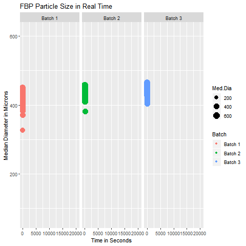
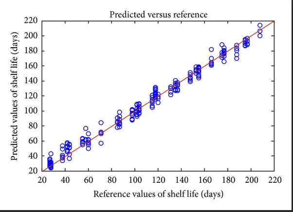
These are simple but tricky cases where the problem you are trying to solve may not need dimensionality reduction, but plotting the data wouldn’t be as simple as plotting an XY chart in Excel. In such cases, you can get help from data analysts who can suggest statistical software like Minitab and JMP to select the appropriate data analytics technique. In case you can’t access them, you can hire your data analyst friend to write a code for you to visualize that data. An example of such a exploratory data analytics method is shown below:
Data Analytics Method for Highly Dimensional Data with Grouping Patterns
Suppose your data is highly dimensional with too many rows and columns that can not be plotted on an XY plot or even with the help of your data analyst friend, then you need a data analytics method for dimensionality reduction. For example methods like PCA or LDA can help you manage such data. However, the grouping pattern in the data can be visualized if you can assign a group to each observation in your data set. These methods don’t only give you an option of visualizing your data but also give you a chance to determine the group of an unknown sample.
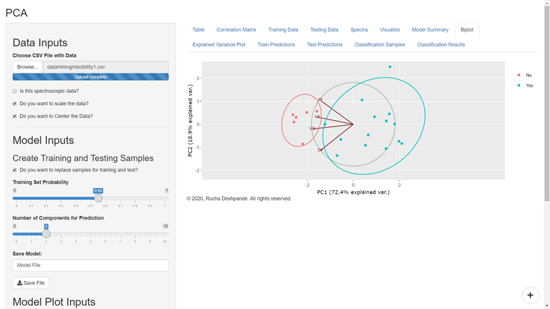
For example, suppose you used data from four mango species by assigning them to four different groups corresponding to their species. In that case, you can train a PCA or LDA model to predict the species of a mango sample whose species is not yet determined.
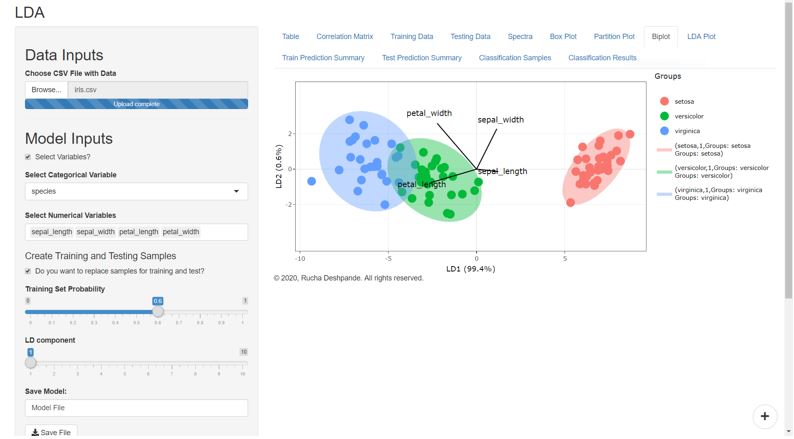
However, it should be noted that LDA models do better when the variables are not highly correlated with each other. Whereas the PCA model works better with multilinear data.
The multicollinearity or correlations between variables occurs when one variable increases or decreases with other variables. For example, if the height and weight of individuals are collected in the form of variables that describe an individual, then it is likely that an increase in height will result in an increase in weight. Therefore, we can say that the data has a multicollinearity problem in such a case.
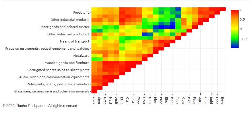
Data Analytics Method for Highly Dimensional Data with Numerical Response
When highly dimensional data is being represented in the form of a number instead of a group, then quantitative data analytics techniques such as PCR, PLS, and MLR come to your rescue. Out of these, PCR and PLS work best on highly correlated data, whereas MLR works best for non-correlated data that follows normality assumptions. That is the reason PCR and PLS (and even PCA) techniques work well with sensor data from spectroscopes.
If you are using DataPandit’s smartMLR application, then you can even build a linear regression model using 2-dimensional data as it can handle small data (widthwise) as well as big data (widthwise).
All these quantitative data analytics methods help you predict future outcomes in numerical format. For example, if you have data of 10 different metals alloyed by mixing in varying proportions and the resultant tensile strength of the alloy. Then, you can build a model to predict the tensile strength of future alloy that can be made by changing the proportion of component alloys.
To Summarize
More data analytics techniques can be mentioned here, but I am mentioning the ones available for the DataPandit users. However, the key takeaway is that whenever you face a data analytics problem, then only start searching for a solution. Don’t be like John, who figured out the solution and then tried to fit his problem into the solution. My two cents would be to let the data analytics method work for you rather than you working for the data analytics method! Don’t stop here, share it with all the Johns who would like to know this!